My Review of Dark Olive by Benjamin Moore

Craving an earthy pop of color for your cabinets or walls? Well you have come to the right place! Today, I am giving my honest review (with real life photos)of Dark Olive 2140-30 by Benjamin Moore...
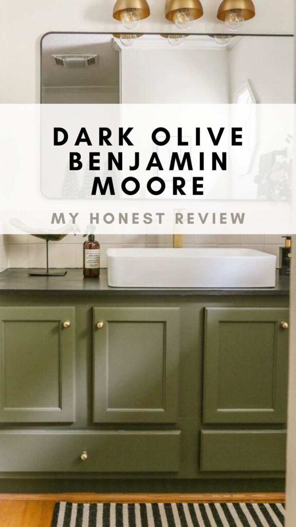
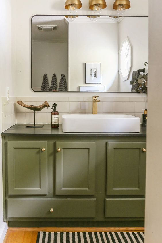
While I tend to shy away from color when it comes to my home paint selections, when it came to updating my sons’ bathroom last year, something about the lackluster space seemed to cry out for a pop of color. (Yes, I have full conversations with the homes I design—call me a crazy house whisperer if you will!)
For your shopping convenience, this post may contain affiliate links. That means I may earn a small commission if you make a purchase through one of my links—at no extra cost to you. As always, I only share products I genuinely love and recommend.
Given the space is primarily used by children, my plans were to lean a little more playful with the color palette with sage green being my initial inclination.
But once I found the courage to venture out of my comfort zone and paint the walls of my living room black shortly after moving into the lakefront cottage, I fell head-over-heels in love with the look and feel of a moody aesthetic.
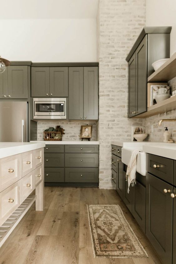
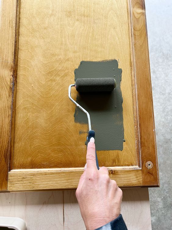
So when I came across this stunning kitchen designed by James May Homes and found out that the cabinet color was Dark Olive by Benjamin Moore, my mind was officially made! And so… one dreary fall day, I mustered up some energy and painted the bathroom vanity and cabinetry.
From the moment I applied my first few strokes of this deep, muted hue I knew I had made the right decision…
What is the LRV of BM Dark Olive?
On the LRV (Light Reflectance Value) spectrum with zero being the lowest value and 100 being the highest, Dark Olive is classified as a 13.52. So while it is lighter than a charcoal black (for reference Sherwin Williams Iron Ore in my living room has an LRV of only 6), Dark Olive is still very much a rich hue which will absorb light rather than reflecting it.
Based on this relatively low LRV, Benjamin Moore Dark Olive is best when used in rooms where you are trying to create a cozy and intimate atmosphere. While it is definitely not dark enough to be grouped with the myriad of black swatches you may considering, it is also not light enough to be considered a mid-tone.
What are the undertones in Dark Olive?
Dark Olive 2140-30 is formulated with a blend of brown, green and just a slight tough of grey (of course I had to throw in a Grateful Dead reference). The warmth and richness of these undertones attributes to the muted, neutral quality of this paint color. But despite its undertones, I have found that regardless of the lighting conditions in my house, Dark Olive consistently reads as a deep, soft green.
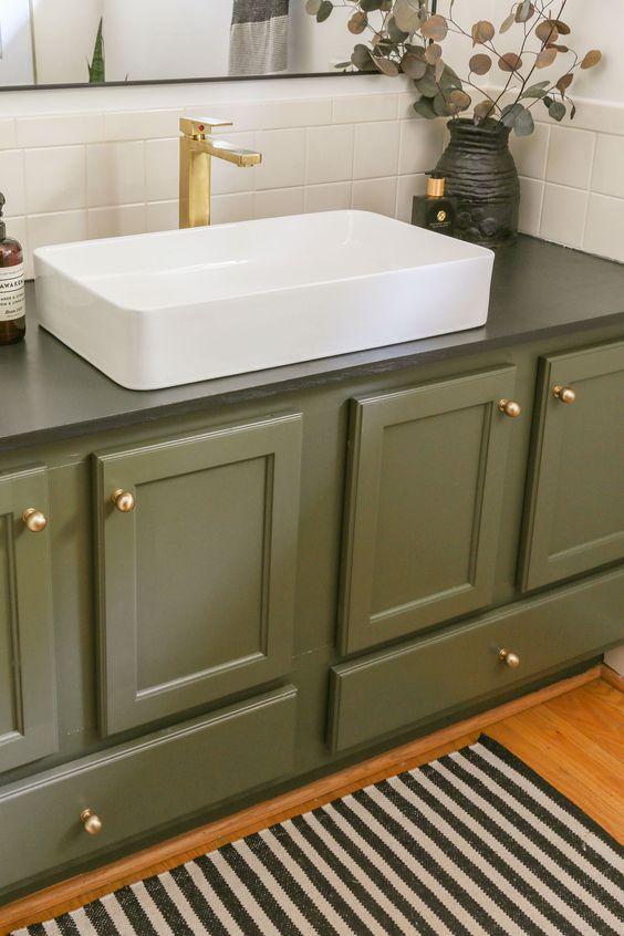
While I used Dark Olive on cabinetry, I also think it would look beautiful on the walls of a powder room, office or den. If you are considering painting this moody hue on your walls, I would recommend also painting the trim and baseboards the same color as this will add to the drama and sophistication.
If you want a pop of color that feels warm yet subtle (and of course reminiscent of Mother Nature’s beauty), I recommend buying a sample of BM Dark Olive and testing it out for yourself!I love using Samplize’s peel-and-stick paint samples because they’re mess-free and made with real paint—no guessing, no wasted gallons. It’s a small step that makes a huge difference.
Thank you so much for stopping by and spending some time with me this week! If you found this post helpful, it would mean so much if you could share this post with a friend or on social media..

Now get out there and design some good vibes along with a fabulous life!


Very helpful! I’m hoping to paint our kitchen cabinets and island in this color along with brass fixtures and a stone backsplash similar in color to James Mays home. Maybe a lighter gray and white quartz countertops, just don’t want stark white for the counters. We have an open floor plan so just trying to decide on wall color to help balance things out as I do like a bright house as well! Any suggestions on what color to paint walls with to help brighten the space but still having the cozy kitchen design? Maybe the Swiss white color? Now to figure out a couch color! So many decisions!!
I am so happy you found my review helpful, Mary! For a bright wall color that is still cozy, I recommend a warm white (and yess…Swiss Coffee is a beautiful warm white which I actually have a separate review about on the blog). I recommend getting samples and testing in multiple lighting conditions before committing to any color. White Dove is a another one to consider. 🙂
Hello,
The vanity looks great. I absolutely love this color although its hard to find other colors that work next to it other than creams. I painted my open concept living room/kitchen this color. We added on so the vaulted ceiling and walls in the living room are all dark olive along with the kitchen walls. The kitchen ceiling is low so painted it white wisp and it works great. Our living room is wall to wall floor to ceiling windows looking out to a lot of trees. I wanted the wall color to blend rather then compete and after many many …many sample colors later this worked perfect. Windows are black… thanks for the article!
I am so happy you found this article helpful, Kris. Your home sounds absolutely gorgeous! 🙂 And yes…Dark Olive is a statement in and of itself, so it looks best paired with neutrals like cream or even wood tones. However, I recently changed the flooring in this bathroom to white and grey checkered tiles, and it goes really well with the green cabinets.
Would this be a color I could use in my mud room / the opposing wall is white. I would use on cabinets.
Hi Pam! I think Dark Olive would be beautiful in a mudroom. I actually considered it for my mudroom cabinets as well. 🙂