
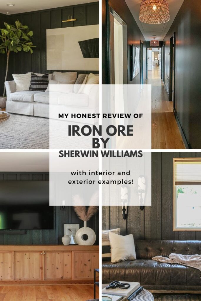
My Review of Iron Ore by Sherwin Williams

If you have been in search of a deep, dramatic paint color for your home’s exterior, doors, cabinets or interior accent walls, you may want to consider Iron Ore SW 7069 by Sherwin Williams. In today’s post, I am giving my personal review of this soft black hue.
A few months ago, I got an unshakeable urge to make a bold statement in my midcentury modern lake cottage.
In a house painted entirely white , both on the interior and exterior, I wanted to create a distinctive zone in my living room that not only contrasted from the light and airy feel of the other living spaces in my home, but I wanted a room that felt cozy, sophisticated and moody- perfect for lounging by the fire and watching television.
From the very beginning, I knew I wanted to go with a black paint color as I had recently been inspired by a designer who painted her dining room walls black. That being said, I was not entirely sure if I wanted something that leaned more into a true black category or if I wanted more of a deep charcoal derivative.
For your shopping convenience, this post may contain affiliate links. That means I may earn a small commission if you make a purchase through one of my links—at no extra cost to you. As always, I only share products I genuinely love and recommend.
After weeks of researching black paint colors and observing the natural lighting conditions of the room, I decided to take my chance on Sherwin Williams’ Iron Ore SW 7069.
What Color is Iron Ore Sherwin Williams?
While Sherwin Williams Iron Ore is considered to reside in the black color family, depending on the lighting conditions of the space, this color can read anywhere from a soft, milky black to a dark, warm charcoal to a deep navy blue and ,in very bright light, a greyish hue with some blue undertones , may be observable.
What is the LRV of Iron Ore SW 7069?
On the LRV (Light Reflectance Value) spectrum with zero being the lowest value and 100 being the highest, Iron Ore by Sherwin Williams has an LRV of 6. For reference, a true black has a light reflectance value of 0.
What Undertones does Iron Ore have?
During my initial research on this color, many people noted that green undertones are often present. However, in my own experience, I do not notice green as much as I see blue undertones.
In my eastern facing living room, Iron Ore reads as a soft black in the subdued morning light. Then, as the day progresses and the afternoon light brightens the space with a considerable amount of natural light, the blue undertones become more prevalent and the color reads somewhere between a black and navy hue.
Iron Ore on Exteriors:
While Sherwin Williams Iron Ore has traditionally been used for interior accent walls, trims, doors and cabinets, as darker exterior colors gain in popularity, Iron Ore proves to be a great choice if you are longing for a dramatic exterior.
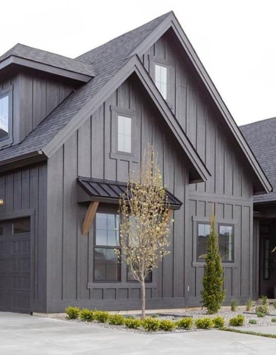
As you can see in this beautiful modern farmhouse designed by Lauren Smyth and pictured directly above, with gray undertones more prevalent in outdoor lighting conditions, Iron Ore reads more charcoal on this exterior. Notice how the true black windows and awning contrast against the lighter black hue of Iron Ore.
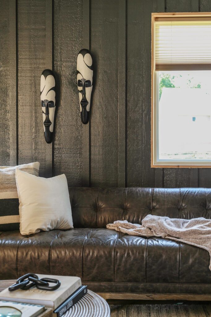
Here on my home exterior, the trim, gutters and door frames are painted in Iron Ore. Contrasting against my white exterior walls (Shoji White by Sherwin Williams) the color reads more like a true black. In certain light, I even notice warm undertones surface on my exterior trim.
When comparing the two exteriors I have included for reference, I believe Iron Ore looks like more of a true black on my home’s exterior because it is only used as an accent color and does not have to contrast with a darker black .
Iron Ore Interiors:
If you aren’t down for doing something as dramatic as I did in my living room, with wall to wall black paint, Iron Ore can still be a great color choice for doors, cabinets and kitchen islands…

Iron Ore Cabinet Color:
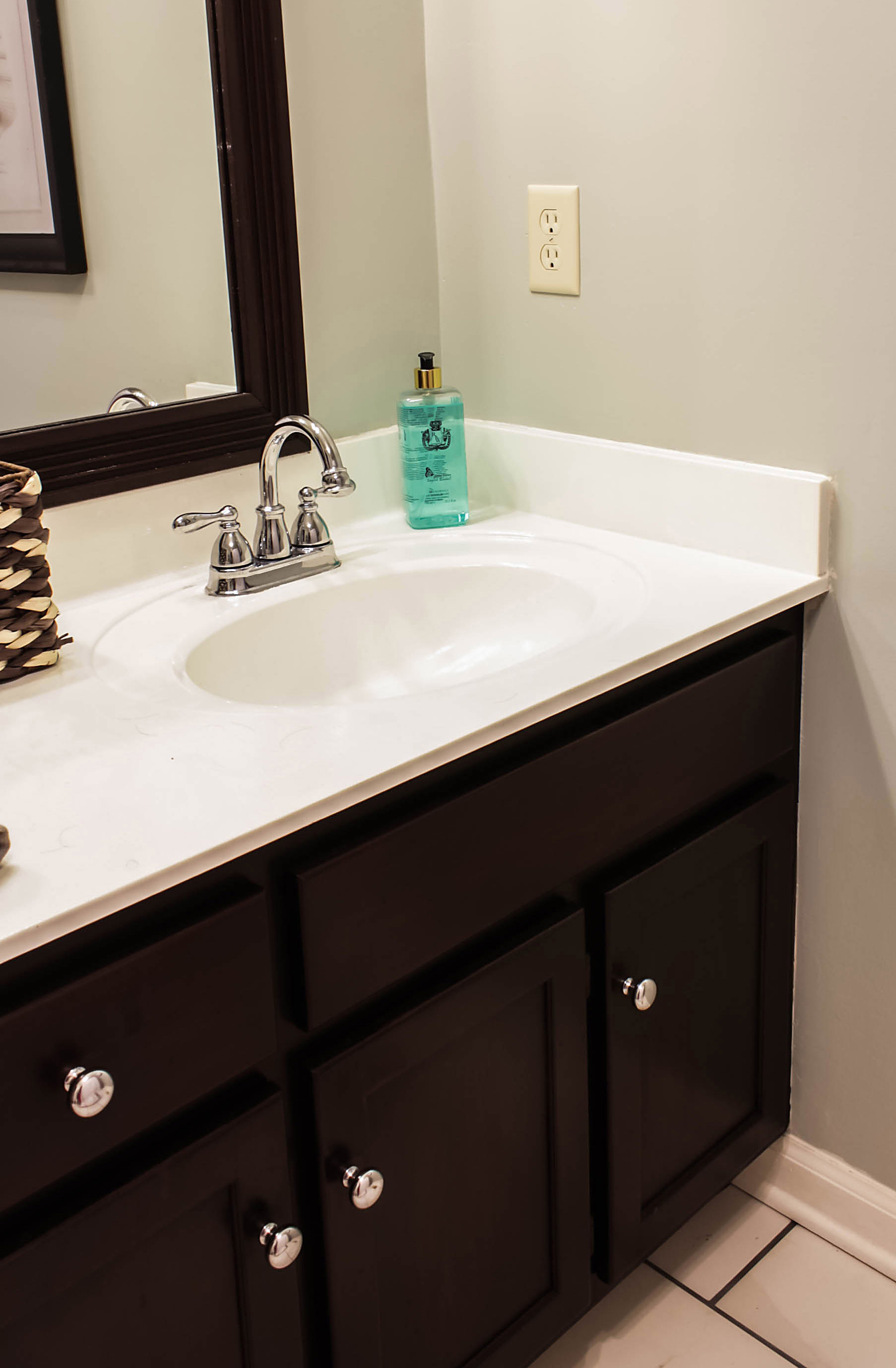
Here in this budget-friendly bathroom makeover by Michelle of Thistle Key Lane, Iron Ore painted on the vanity is a softer alternative to stark black. Not only does it play well with the grey tile floors, but Iron Ore pairs beautifully with the warm white wall color she used on the walls (Sherwin Williams Alabaster).

Iron Ore Accent Wall:
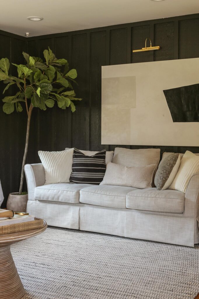
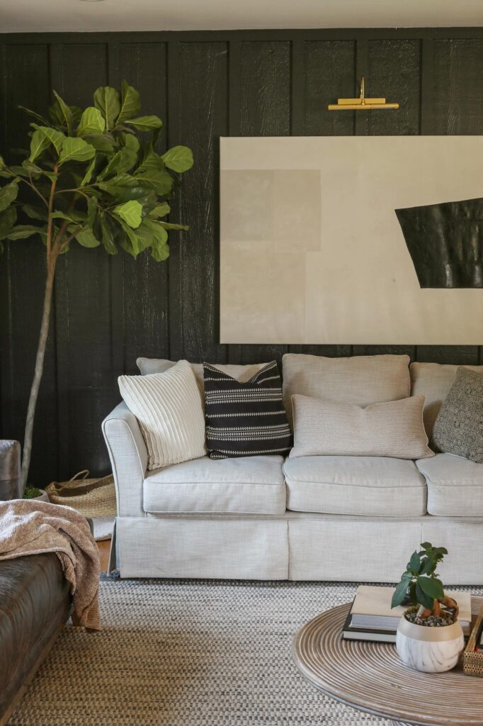
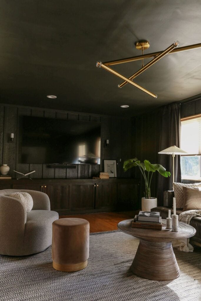
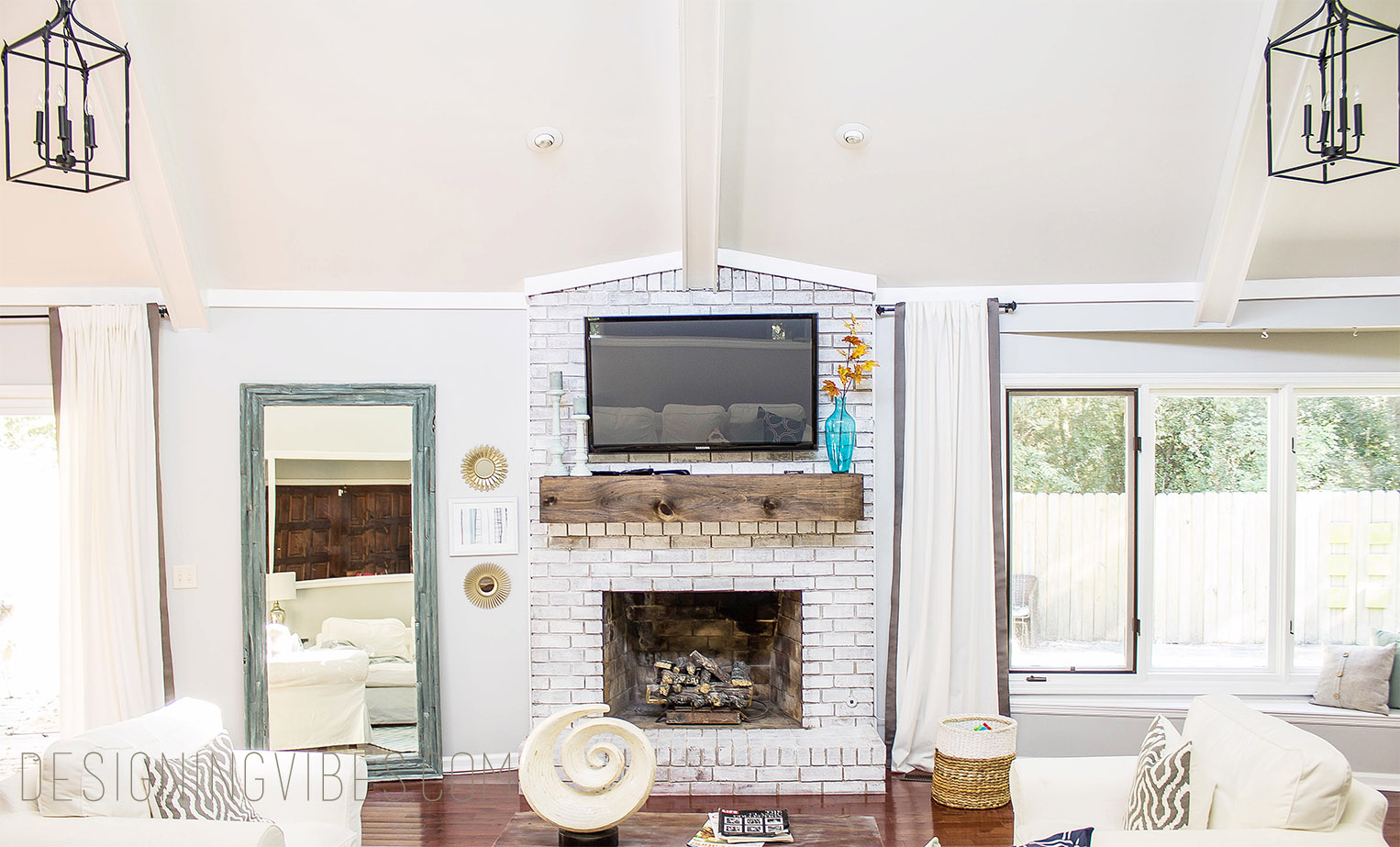
What better way to conceal a gigantic television than painting the surrounding wall color super dark? Here on the board and batten walls of my living room, Iron Ore not only beautifully disguises unsightly technology, but makes for a fabulous, TV accent wall. To keep the feature wall from falling flat, white accents create just the right amount of contrast. The earthy wood cabinets compliment this paint color very nicely as well.
When you want to add moodiness and drama to a space but don’t want to commit to an entire room, an accent wall with dark paint like Iron Ore is a great way to ease your way in to the moody side of design.
Even better? Unlike some lighter paint colors, Iron Ore is so rich and dramatic that no special wall covering is needed to beef up this design effect. Simply put? The paint color is a feature in and of itself.
What Color Goes with Iron Ore?
If you are wondering which wall or trim colors go well with Iron Ore, warm whites, greens and other earth tones are your best bet.
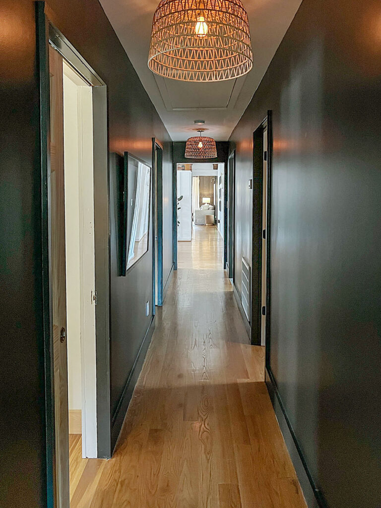
The warm white walls on the remainder of my interior walls (Shoji White by Sherwin Williams), work beautifully with Iron Ore (painted on my hallway and living room walls). To keep the vibe from feeling too coastal or preppy (I wanted moody and dramatic), I chose not to paint my doors, trim and baseboards white.
Instead, I painted the trim and baseboards in Iron Ore and left the doors in the original raw wood as this soft black compliments organic elements like wood tones, rattan, jute and even brick….
Although Sherwin Williams lists Extra White SW 7006 and Nebulous White 7063 as recommended complimentary colors, it is important to sample Iron Ore against whatever color you are considering for your trim color.
Some designers advise against pairing Iron Ore with colors that have a blue undertone, but ultimately, it depends on the unique lighting situation of the space you are working with. It also depends on the aesthetic you are aiming to acheive.
From personal experience, I can say that white-white (no undertone) and warmer whites work just fine with SW Iron Ore for trim, ceiling and door colors.
Is Sherwin Williams Iron Ore black or grey?
When doing my research on SW Iron Ore 7069, it was really hard to tell if the color was truly black or grey based on photos alone.
What I have come to realize by using this paint color in my own home is that your unique lighting exposure will determine if Iron Ore reads more black or more grey. The less natural light a room has, the more black Iron Ore will appear. This is why exteriors painted in Iron Ore tend to look more grey/Charcoal than true black.
For a little more perspective, lets consider the light reflective value of this paint color compared to other hues in the black family.
Truer black colors popular on the market today like Sherwin Williams Tricorn Black and Black Magic have an LRV of just 3 (remember true black is 0). With an LRV of 6, Iron Ore is significantly lighter than its darker colored contenders, but notably darker than its grey counterparts like Sherwin Williams Peppercorn (LRV 10) and Benjamin Moore’s Kendall Charcoal (LRV 14.61).
With this considered, Iron Ore is darker than a charcoal, but not a true black. Ultimately, this paint color falls somewhere in between a grey and black tone.
Whether you are looking to add some modern drama to the exterior of a farmhouse or elevate an interior space with moody sophistication, Iron Ore may just be the perfect choice for your home.
What I personally love about this dark yet neutral paint color is the fact that it is super deep and saturated without feeling too cold or stark.
The green, grey and blue undertones add a nice softness to the color – allowing you to have the best of both worlds (contrast and coziness).
Truly versatile, Iron Ore works well with a variety of aesthetics including farmhouse, midcentury modern, organic modern, rustic and maximalists styles.
And while this color ended up being the perfect choice for my needs, never ever paint a room without first sampling the color to test how it works with your unique lighting conditions, furniture, existing accent colors, and door and trim paint. Samplize makes this process super easy with their peel-and-stick samples made from real Sherwin-Williams paint- no messy paint trays or brush cleanup required.
It’s also important to note that the color will vary based on what brand, sheen, and product line you use.
**Updated December 2025: In fact, after living with Iron Ore on my living room walls for over 2 years, I loved the moody color so much that I decided to paint the ceiling of the same space as well…
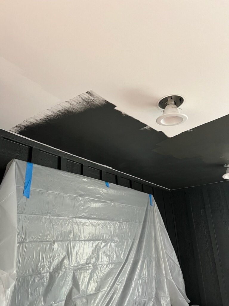
Instead of using Sherwin Williams for the actual paint, out of sheer convenience, this time I used a Benjamin Moore color match formula. What I immediately noticed as I began to paint the ceilings is that the color match version had more warm and green undertones than the version I used on my walls (which was directly mixed at a Sherwin Williams store).
While it’s not wildly obvious at first glance, there is a difference- and it’s why I always stress sticking with the same brand and sheen from sample to final coat. Even color-matched paints can read differently once they’re on the wall.
I hope you found this paint review helpful! It would mean the world to me if you could share it with a friend or on social media..

Now get out there and design some good vibes along with a fabulous life.

Welcome!
My journey in interior design and home improvement began with transforming my first fixer-upper home, all while managing a budget and raising two young boys. My work, a reflection of my passion for creating beautiful, uplifting spaces, has been recognized by top publications like Better Homes and Gardens Magazine, HGTV, and more. I invite you to explore my site and witness the transformation of my home and the vibes we've designed. Read more...


I think Iron Ore is my absolute favorite color. Since using it years ago on outdoor Victorian ornate railings I’m now on a mission to convince as many people as I can to shed the fear and go beautifully bold.
Yesss!! I bet your Victorian is gorgeous. Iron Ore on exteriors is an absolute show-stopper.
Hi there! It looks like your paneling has a decent amount of texture on it still; I am considering painting some pretty rough paneling in Iron Ore and was wondering how the process went for you getting the paint on with the texture? Originally I thought I’d have to sand it down quite a bit, but I like how yours looks still showing a lot of texture. Thank you!!
Hi Lauren! I just painted the Iron Ore over the existing paint that was on my cedar panels (I didn’t sand at all). That said, I do not know if anyone sanded the panels the first time they were ever painted or not. Hope this helps! 🙂
We just painted my husband’s office in iron ore. It such a pretty color. I really like how you did the color drenching. We didn’t but I am tempted after seeing your post. I am curious what curtains you went with. Are they the same color as the walls? They seem to blend nicely.
Hi Tricia! I say go for the color drench…it is so cozy and enveloping. 🙂 As far as the curtains, the color is called “dark gravel” and it is super close to the wall color. Here is my affiliate link to the exact curtains I used in the space. https://on.ltk.com/+Pr6nb0zY1NZcwDGQddrCOA
Hope this helps!
Hi there. We are getting ready to paint our guest house this color and I love it! You did a great job. Wondering where you got your gold ceiling light from? I love the sleek lines of it.
Yay!! I am so glad you enjoyed the color, Andrea. 🙂 I got the light from West Elm (I went with the larger size). Here is the affiliate link to the exact chandelier.. https://on.ltk.com/+c1n8JkUFSEjlm9hEVv3nVQ
Hope this helps!