
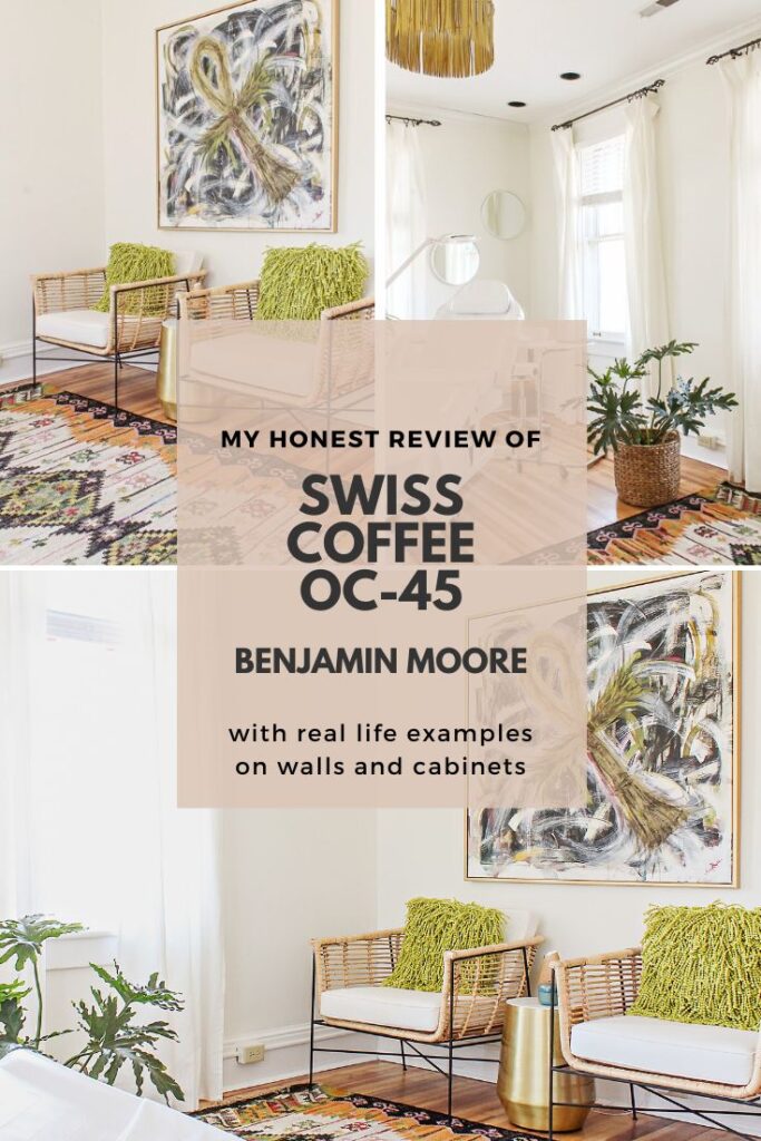
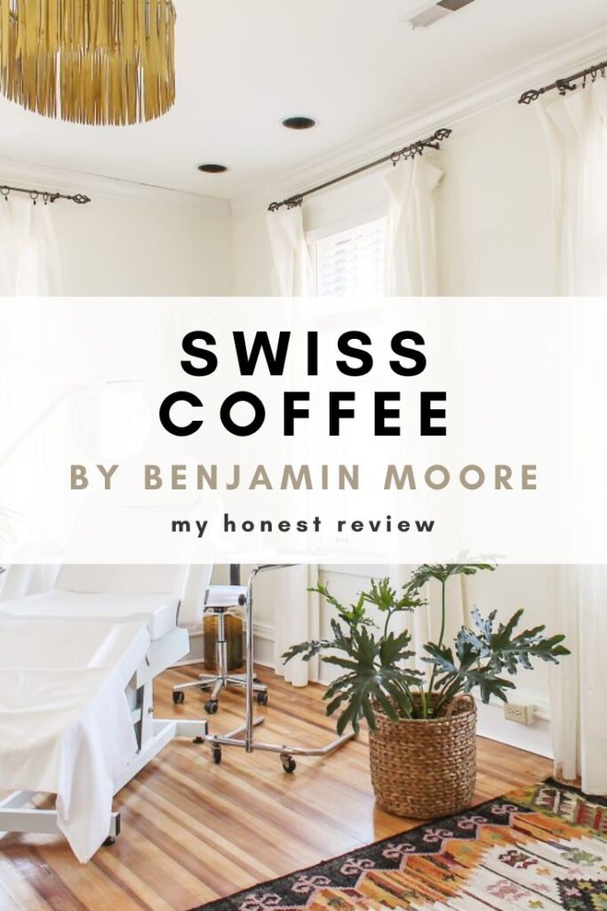
My Review of Swiss Coffee by Benjamin Moore
Whether it’s farmhouse, boho or a modern organic aesthetic that tickles your fancy, all of these design trends are currently sporting a common denominator- white walls. Today, I am reviewing a particular shade of white paint- Swiss Coffee OC-45 by Benjamin Moore.
Chances are… if you have been researching white paints recently, you have probably found yourself overwhelmed in a rabbit hole of swatches. Who knew there could be so many damn shades of white? Seriously though.
To narrow down all of the paint swatch madness, I recommend starting with one simple question…
Are you looking for a white with warm undertones, a white with cool, crisp undertones or a white with no undertones at all (a white-white with no tint whatsoever)?
For your shopping convenience, this post may contain affiliate links. That means I may earn a small commission if you make a purchase through one of my links—at no extra cost to you. As always, I only share products I genuinely love and recommend.
If you are looking for a creamy, warmer white, you will probably want to go out and buy a sample of Benjamin Moore’s Swiss Coffee OC-45 (and read the rest of this post). If you are looking for a brighter, crisper white, you should check out this paint review I did a few months back.
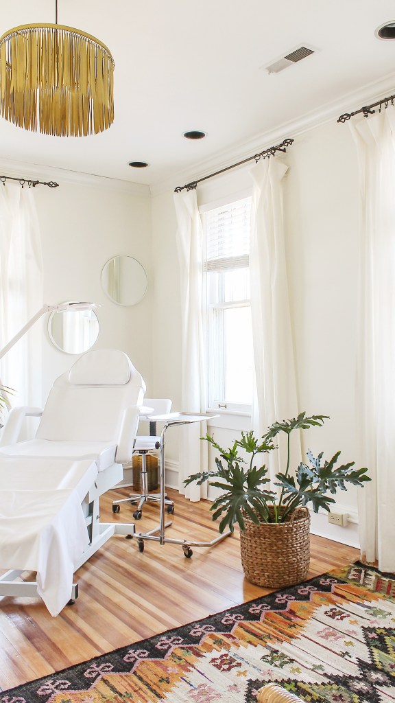
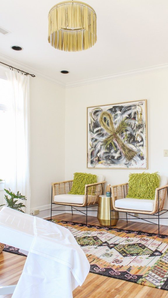
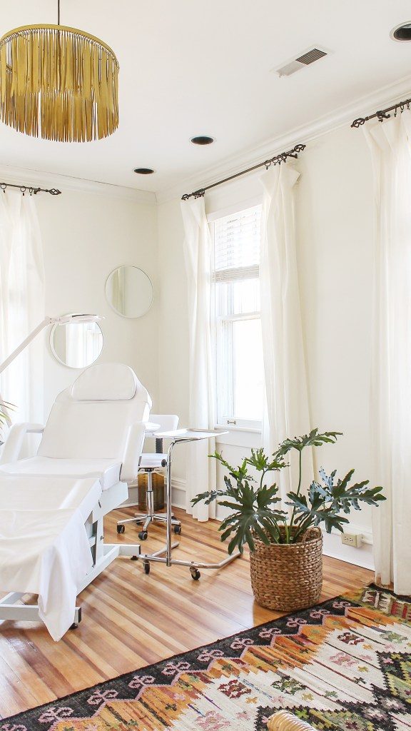
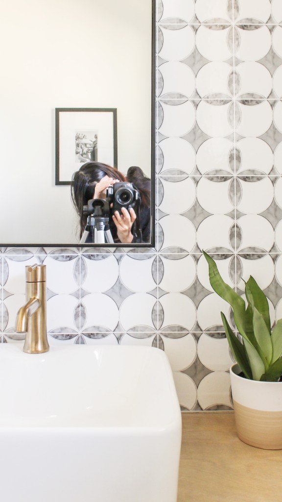
My personal experience with Swiss Coffee involved a boho chic, spa treatment room I designed for a client about a year ago…
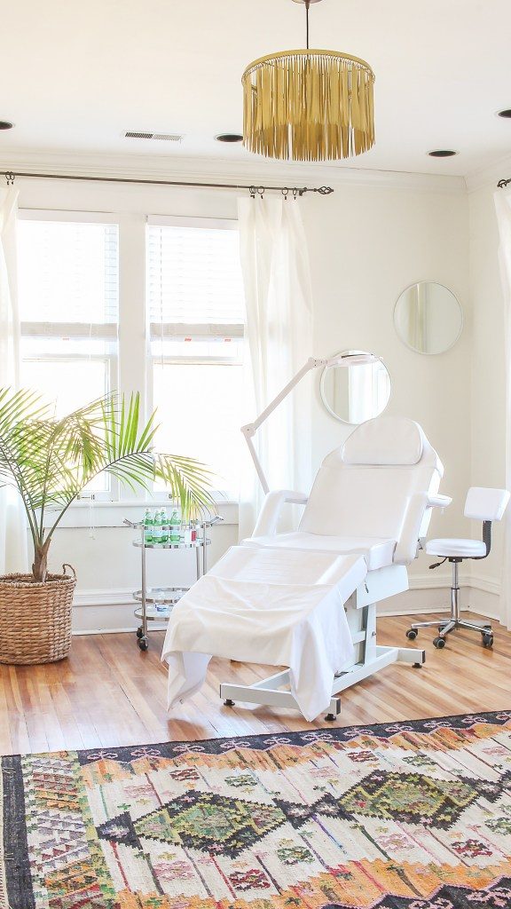
The goal of the space was to achieve a balance of earthy-zen like vibes while maintaining a certain degree of glam and elegance.
Swiss Coffee rocked this balance quite beautifully. The off-white, creamy nature of this particular tint lends a welcoming softness and elegance to the space. And while this particular hue does not reflect natural light as loudly as a true, crisp white would, I think that trait is, in part at least, what keeps the space from feeling too clinical (and more spa).
It is important to note however, that the undertones which lend it’s softness and warmth can read yellow/gold in certain lighting (as shown in the picture below)…
Contrasting against the white-white of the baseboards and Crown Molding, you can see where Swiss Coffee’s golden undertones can become more pronounced at certain times of the day.
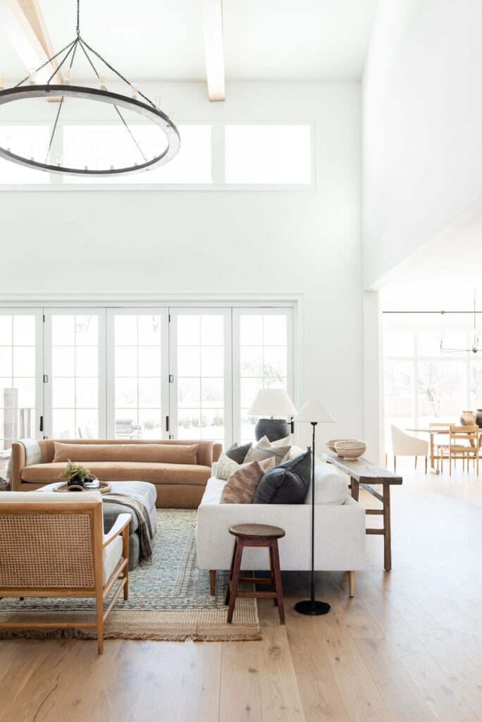
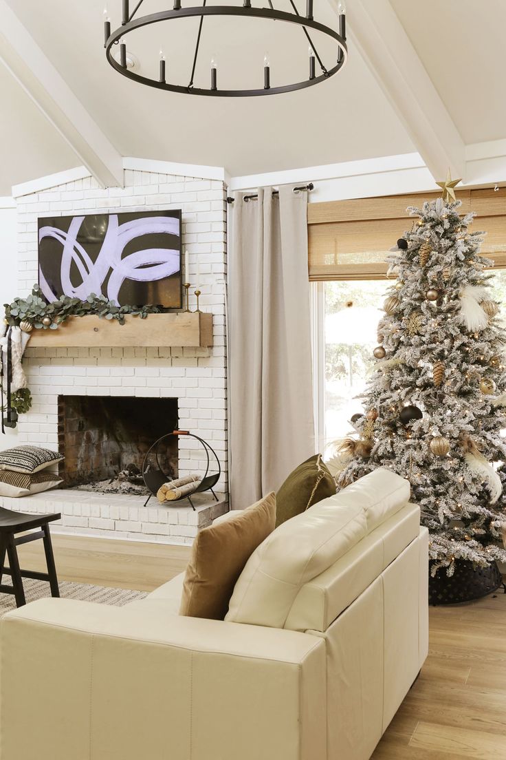
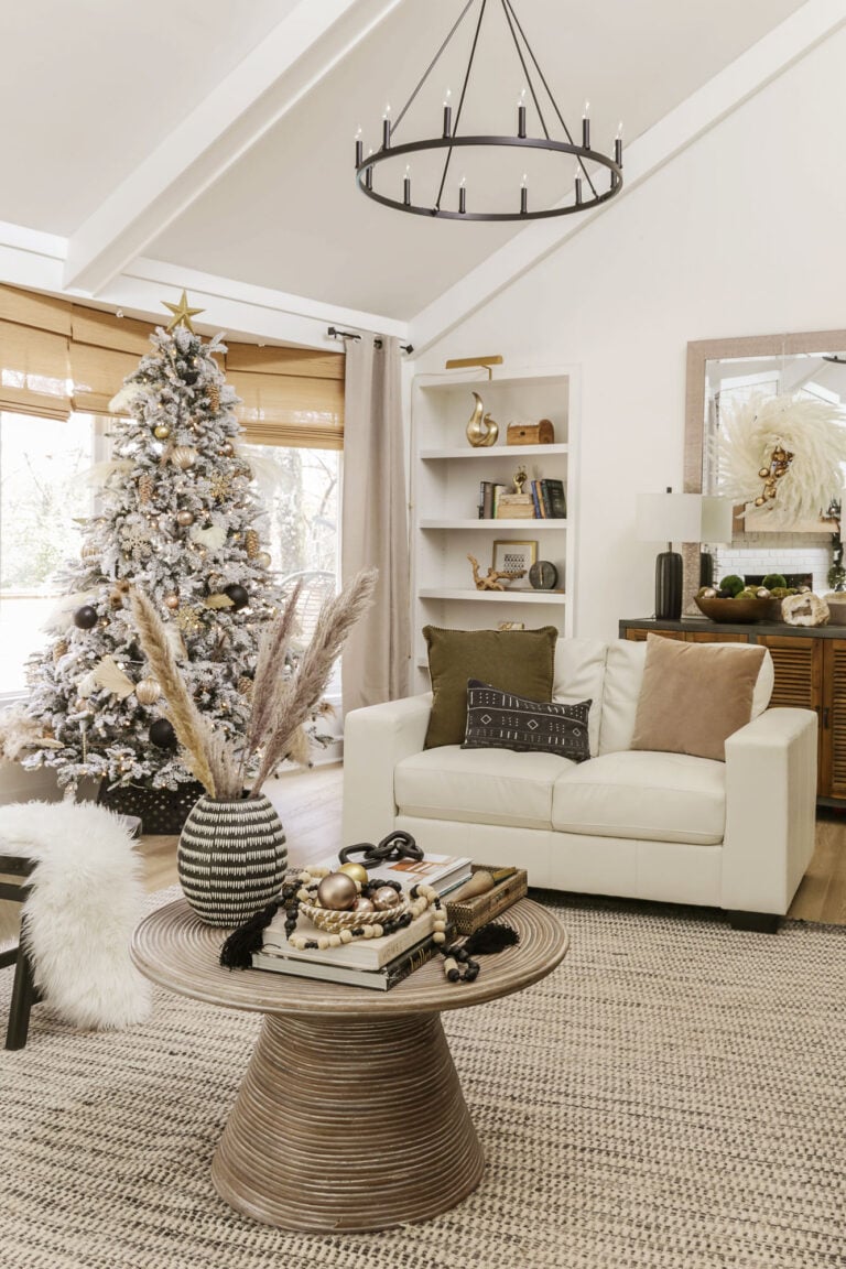
To see this hue in a residential setting, I have included one of my favorite designer’s, Studio McGee, recent projects…
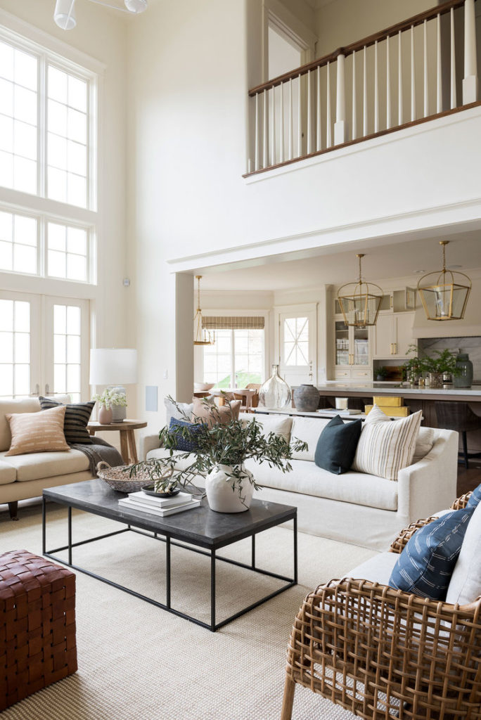
In contrast to a bright, crisp white, this off-white paint color exudes more of a softness and coziness..all while still establishing a fresh and classy aesthetic.
As I mentioned, this hue does not reflect the sunlight as much as a true white would, but what it lacks for in brightness, it makes up for in warmth.
In case any of you are considering a warm white for your kitchen cabinets, Studio McGee painted the cabinetry pictured below in Swiss Coffee …
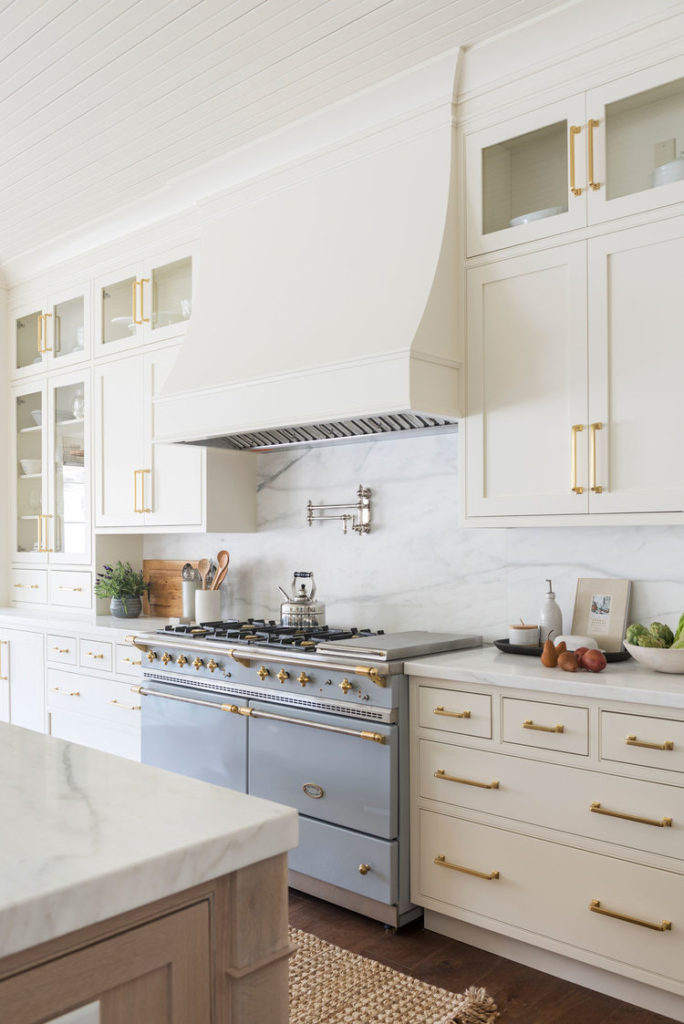
As you can see, the creamy nature of Swiss Coffee becomes more apparent paired with the cooler tones of the marble backsplash and the cool grey of the stove. In my opinion, Swiss Coffee on cabinetry is best suited for a more traditional aesthetic.
If you are looking for a white paint that blends airiness with warmth, Swiss Coffee may be exactly what you have been searching for.
For unedited video footage (taken with my phone) of this paint color, be sure to check out the video I have embedded in this post. It will help you get a better sense of the undertones.
What is the Light Reflectance Value of Swiss Coffee OC-45?
On the LRV (Light Reflectance Value) spectrum with zero being the lowest value and 100 being the highest, Benjamin Moore Swiss Coffee has an LRV of 81.91. For reference, White Dove, another popular warm-white made by Benjamin Moore is slightly lighter, with an LRV of 83.16.
At any rate, it is important to note that the LRV of this off-white paint color is significantly lower than that of a crisper white like Chantilly Lace which has an LRV of 90.4.
If you love the warm tones of Swiss Coffee but wish it to reflect more light, you can always reduce the saturation of this paint color. In fact, in the actual home of one of my favorite designer’s, this color was reduced down to 75% strength…
Designer , Shea McGee, says she made the choice to reduce this color by 25% as the yellow undertones were too prevalent at its full strength.
What are the undertones in BM Swiss Coffee?
While some may experience grey and green undertones with this off-white paint color, in my personal experience, I have distinctly noticed golden and yellow undertones. I find that the less natural light a room has, the more yellow undertones will be noticeable. Trim color will also effect how the undertones read.
What Trim Paint Color and Window Frame Colors go with Swiss Coffee?
When choosing coordinating trim, door and window frame paint colors to go with Swiss Coffee OC-45, I recommend staying away from paints with cool blue undertones as this can give a very dingy, yellow effect to the warmth of Swiss Coffee.
Your safest bet is to go with a slightly lighter warm- white like Benjamin Moore White Dove OC-17 or go with a tone on tone effect- using Swiss Coffee on the baseboards, and trim as well as the walls.
When going tone on tone, I recommend using a different sheen on the millwork. Typically, I like to go with eggshell on walls and satin or semi-gloss on baseboards.
If you really want your trim to pop, going with a white-white (no tint) is also a great choice.
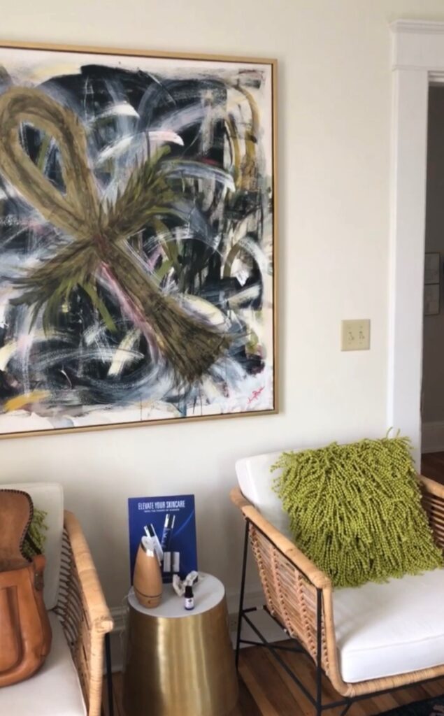
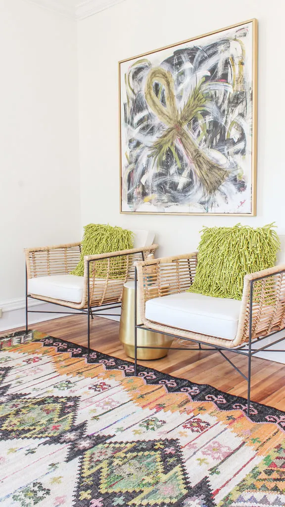
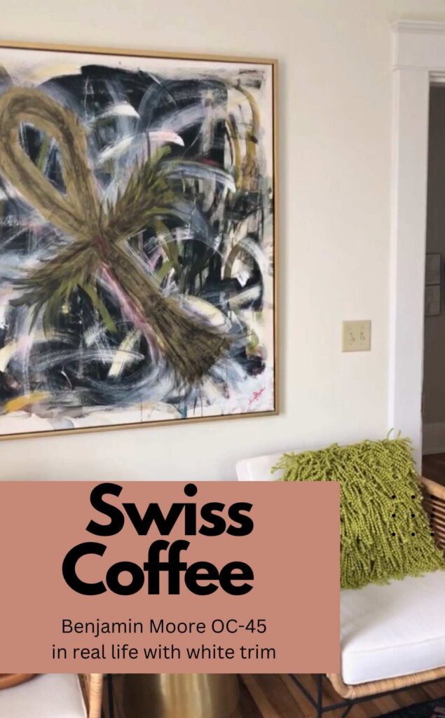
Above, I have taken a picture of a client’s spa room who used a pure white on the trim. This picture was taken in a low-light situation. Notice how the pure white of the trim and furniture upholstery considerably contrasts with Swiss Coffee painted on the walls.
What I love About this Swiss Coffee Paint Color
One advantage of going with more of an off-white color versus a crisp white is that it tends to be more forgiving in high-traffic areas (especially if you have pets or kids).
While more pure whites can feel stark in overcast or cloudy lighting conditions, the warm undertones in Swiss Coffee allow for a welcoming softness while still being very reflective of light. In my opinion, it’s a total win-win.
In recent years, I have noticed that creamy whites are becoming the more “in” choice of designers as they give off not only a sophisticated vibe, but a welcoming feel. As time goes on, I believe this off-white will never really go out of style.
Proving the versatility of this paint color, Swiss Coffee has been used in just about every sort of application. Whether it be on exteriors, living rooms, dining rooms, foyers, bedrooms, or hallways, you really can’t go wrong with this paint color. That is…unless you aren’t keen on the creamy, golden undertones.
In that case, you may want to reduce the strength of the paint formula or go and get some more swatches of paint in Benjamin Moore’s or Sherwin Williams off-white collection.
If warm white just isn’t your jam, you will want to explore the more pure, crisp white paint samples.
Before committing to a paint color on the total wall area, it’s super important to test your sample on a smaller portion of the room and observe it under multiple lighting conditions over a few days. I love using Samplize peel-and-stick samples for this- they’re made with real Benjamin Moore paint and let you test the color without the mess or hassle of painting swatches directly on your wall.
Realize that the brand and product- line of paint you choose will also effect how this paint color looks. In my experience, color matching from other retailers is not always accurate!
I hope you found this paint color review helpful!
If you are still considering more off-white paint colors, you may also want to check out my review of Sherwin Williams Shoji White.
Now get out there and design some good vibes, and please be sure to share on social media or with a friend if you found this helpful (it truly means the world..thank you!)


Welcome!
My journey in interior design and home improvement began with transforming my first fixer-upper home, all while managing a budget and raising two young boys. My work, a reflection of my passion for creating beautiful, uplifting spaces, has been recognized by top publications like Better Homes and Gardens Magazine, HGTV, and more. I invite you to explore my site and witness the transformation of my home and the vibes we've designed. Read more...


Our home was newly painted from top to bottom in Swiss Coffee when we bought it. I love it, it works for me since I like the warmer tones. Great post.
That is so awesome, Marty. I am actually envious of you then…I have been craving more warmth on my walls lately too. Transitioning from a cool grey to a warmer white in my house has been a painstakingly slow undertaking. Have a great rest of your week, my friend.
What color trim did you use in the spa treatment room? Thank you!
Hi Mckenzie!We used a white-white (no tint) paint for the trim. I hope this helps!
Hi , I have finally decided on Swiss Coffee for most of my new home build. I’m trying to decide between Chantiily lace or White Dove for trim. Both are Benjamin Moore. I see that you suggested White/white, but wondered what you think of the 2 choices i mentioned above.
Sounds like your kitchen is going to be gorgeous, Donna. I actually have Chantilly Lace on the walls in my kitchen and love it. It is more of a crisp, bright white but still has a certain warmth about it. However compared to Swiss Coffee, it would probably look more like a white-white. I actually have a detailed review of this color on my blog. Here is the link to it https://designingvibes.com/my-review-of-benjamin-moores-chantilly-lace/
While I have never personally worked with White Dove, it will be warmer/creamier than Chantilly Lace (which is a little crisper). Knowing this, I would assume that Chantilly Lace would probably provide more of a contrast against Swiss Coffee. If at all possible, I suggest getting samples of both and then holding them against the Swiss Coffee walls or sample of Swiss Coffee to see how they play off of each other. Trim color can definitely make or break your wall colors and I have always gone with a white-white for my trim and baseboards.
What would you do with doors if you’re doing tone on tone with trim and baseboard?
Hey Ana! It really just depends on if you want your doors to pop from everything else. There really is no wrong answer, but you can certainly paint the doors the same color as the walls and trim. 🙂
Curious about the greenish pillow. Where did you find those?
Hey Karin! Those pillows were a Homegoods score. 🙂
I’m coming close to finalizing the redesign in my daughter’s/guest bedroom. I had two walls painted with Swiss Coffee and the other two in a dark teal. I’ve finally decided that the teal walls have to go! I want to do tone-on-tone (“color drenching”) in this bedroom. Any thoughts on doing the walls, trim, doors AND ceiling all in Swiss Coffee (walls and ceiling in flat/matte and trim/doors in satin)? I have Ikea bookcases that I will have along part of one wall. I want to put a wood veneer on the back wall of the bookcase and paint the front a darker shade of cream. With Swiss Coffee on the walls and adjacent closet doors, do you have any suggestions on what color may work best for the bookcases? Any suggestions would be really appreciated. Thank you!
Hey Karen! I think Swiss Coffee on walls, trim, doors and ceiling in the paint finishes you mentioned are totally fine. 🙂
Thank you so much for this post; it confirms my decision that this is the color for the majority of my open house layout. I would like to have some accent colors, a dark blue in my dining room. I have a back hallway leading to the main house. Could I paint a soft cream like Bavarian cream on a wall leading to walls with Swiss coffee?
I am so happy to hear you found my review helpful, Sue! You certainly could do a cream color with Swiss Coffee as both have warm undertones. Personally, I prefer to stick with the same color throughout the house and only change it up with a distinctly different color in certain rooms like an office, den or powder room. 🙂
Great review! Love this paint colour and use it a lot. Quick suggestion. A modern way to avoid highlighting the yellow undertones of an off white wall paint is to paint the ceiling and trim the same colour as the walls.
Thanks for the helpful tip, MJ! 🙂
Great post! Can I ask where the rug in the spa room is from?
Thanks, Alexandra! It is from World Market. 🙂
I would like to paint my bedroom in Swiss coffee, would that look nice with all oak trim , floors and doors? I also have white popcorn ceiling. Do you recommend keeping that white?
Thank you !