

5 Green Paint Colors That Act Like Neutrals
Trying to find a green paint color that creates more atmosphere than color? Today I’m sharing five earthy green paint colors that act like neutrals- making them perfect for walls, cabinets, and anyone who’s a little hesitant to embrace color...
I’ve developed a completely unscientific (and probably grossly oversimplified) theory that there are three types of decorators…
The first are the insanely talented artsy b*tches who can boldly mix color and pattern throughout their home with seemingly no rules whatsoever (yet somehow it all looks intentional and ridiculously cool).
The second are the quiet luxury girls who can decorate an entire room in black, white, oak, and layers of texture, making it look straight out of Architectural Digest.
And then…there are people like me…
The kind who admire color from afar but are a little too sensitive to live with it every day. And so…we spend years convincing ourselves we’re just not “color people”…until we accidentally discover the one color our highly sensitive nervous systems can actually tolerate.
For me…that color is green.
Not because I think of it as a color statement per se, but because I think of it as an extension of nature. Somehow earthy greens have this magical ability to warm up a room, add depth, and breathe life into a space without ever feeling loud or overwhelming.
That’s why I often say the “right” greens (and for me, that’s always the muted variety) don’t really behave like colors at all…they act like neutrals. So if you’ve spent years convincing yourself you’re simply “not a color person,” these are the five green paint colors I’d recommend looking at first…
1. “Dark Olive” by Benjamin Moore-
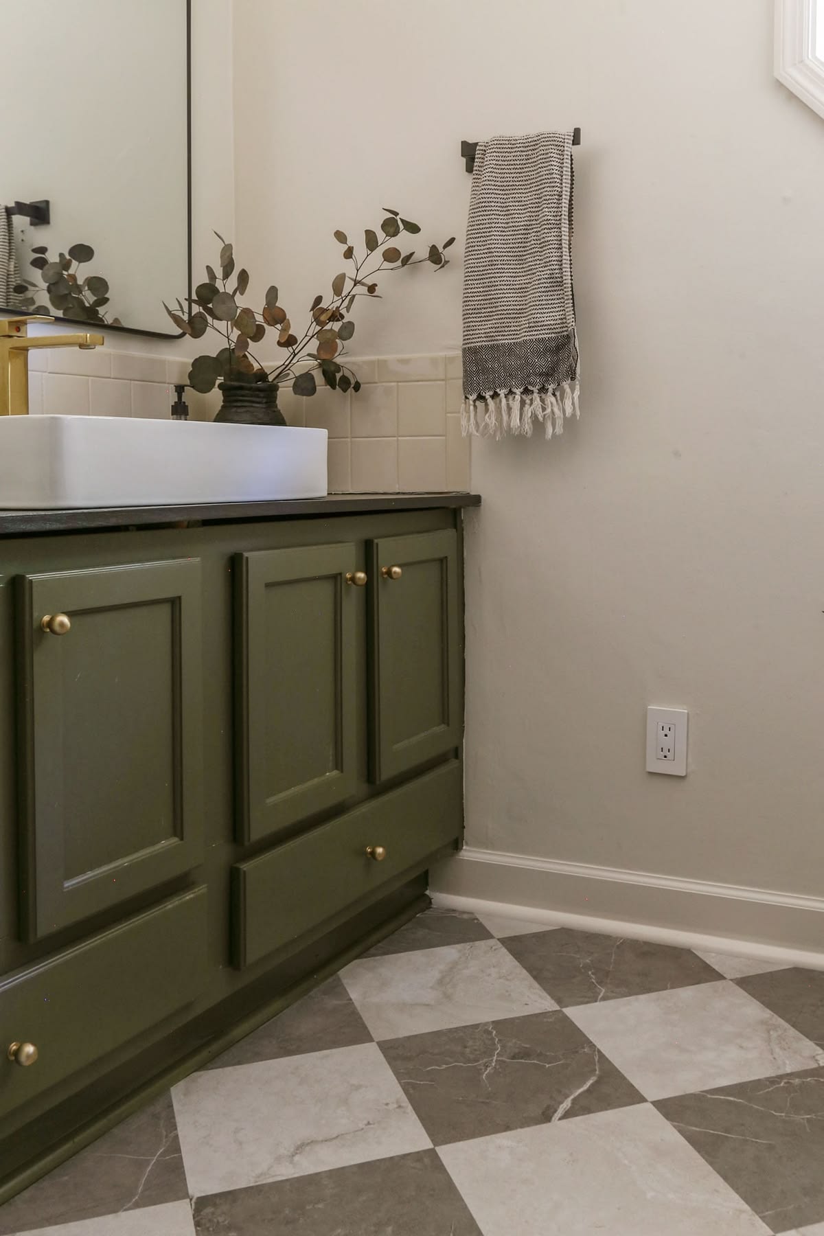
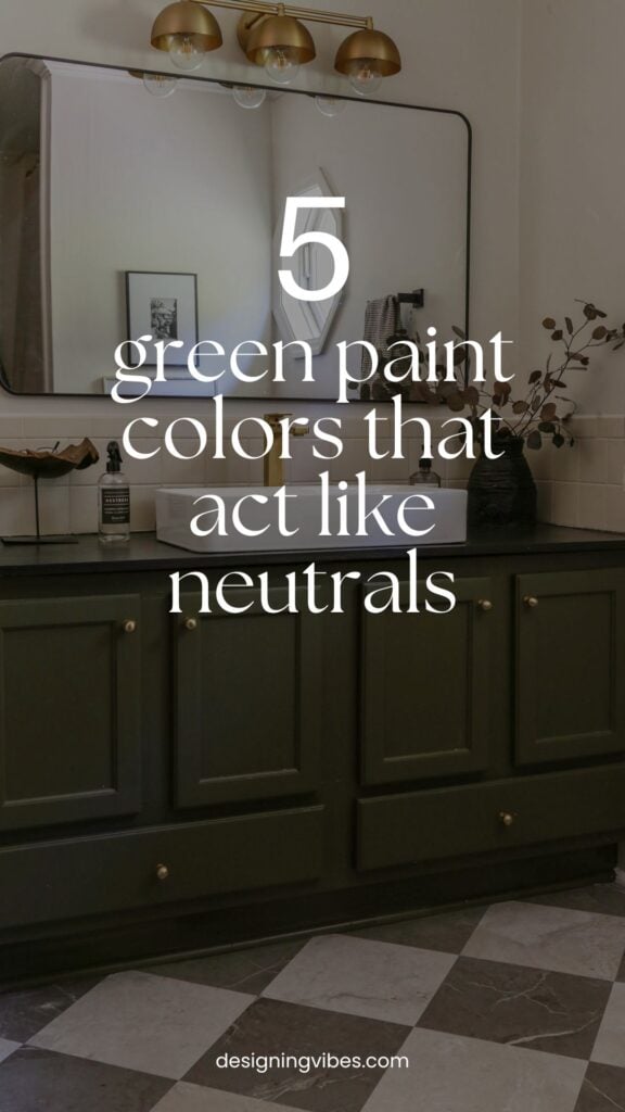
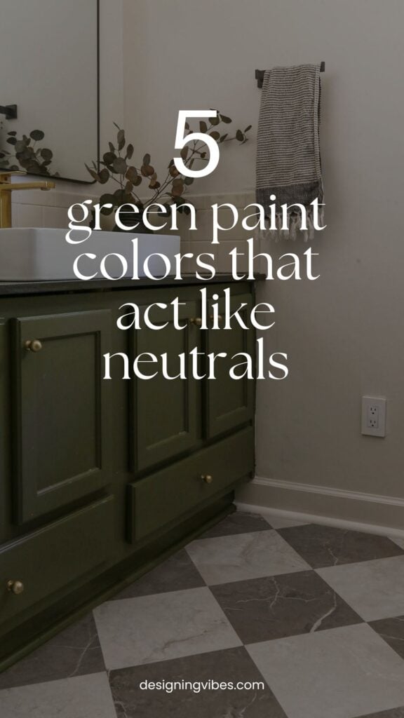
When I painted my boys’ bathroom vanity Benjamin Moore Dark Olive a few years ago, it marked the first time I had really embraced color in my otherwise moody lake cottage.
Up until then, I had played it pretty safe with warm neutrals, black accents, and plenty of texture. But despite all of that, this little bathroom still felt like it was missing something.
Dark Olive turned out to be exactly the pop of color the space needed…
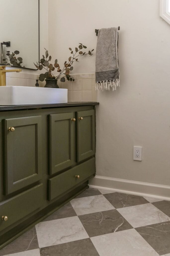
What I love most about this color is that despite being unmistakably green, it never actually feels “green green.” Instead, it quietly grounds the room- pairing beautifully with the warm brass hardware and checkerboard tile- without feeling “cutesy” or juvenile.
With an LRV (Light Reflectance Value) of 13.52, Dark Olive is considered a deep, rich hue. It absorbs much more light than it reflects, making it an excellent choice if you’re trying to create a cozy, intimate atmosphere. While it isn’t quite dark enough to venture into black territory (for comparison, Sherwin Williams Iron Ore has an LRV of just 6), it definitely isn’t what I’d consider a mid-tone either.
Best for: Bathroom vanities, kitchen islands, built-ins, libraries, mudrooms, or anywhere you’re looking to introduce a little depth without committing to a charcoal or black.
2. “Duxbury Gray” by Benjamin Moore-
If there was ever a paint color that convinced me I wasn’t actually craving more color…I was craving more atmosphere, it would be Benjamin Moore Duxbury Gray.
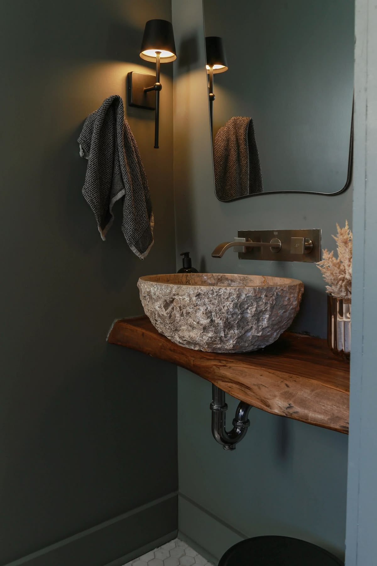
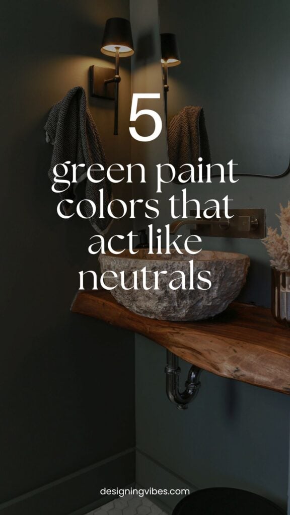
My powder room is south-facing, so I knew I wanted a green that would stay sophisticated throughout the day (without becoming too muddy as the light shifted.) Rather than reaching for one of the trendier botanical greens, I intentionally gravitated toward something that felt more like a weathered mineral than a leafy plant.
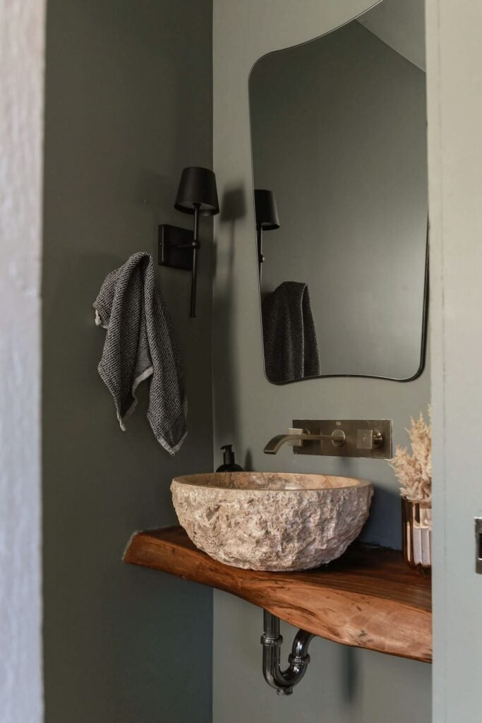
Despite its name, Duxbury Gray is far more green than what I would consider a true gray paint color. But unlike brighter botanical greens that can sometimes feel a little too shamrock for my taste (making me suddenly crave a Guinness and shepherd’s pie), this historic mineral green has just enough blue-gray influence to keep it feeling timeless and wonderfully elusive.
With an LRV of 23.6, Duxbury Gray falls comfortably into the mid-tone range- creating an enveloping atmosphere without making a room feel overly dark.
One of my favorite things about this color is how effortlessly it bridges warm and cool materials alike. In my own powder room, it beautifully complements the cooler marble hex tile floor while still playing nicely with the warmth of the live-edge wood vanity and travertine vessel sink.
That’s exactly why I believe this color acts like a neutral. Instead of becoming the focal point of the room, it quietly elevates everything around it.
Best for: Color-drenched rooms and spaces with a mix of warm and cool finishes.
3. “Rosemary” by Sherwin Williams-
While I have yet to use Sherwin Williams Rosemary in my own home, it was one of the handful of green paint colors I had saved while researching cabinet colors for my boys’ bathroom.
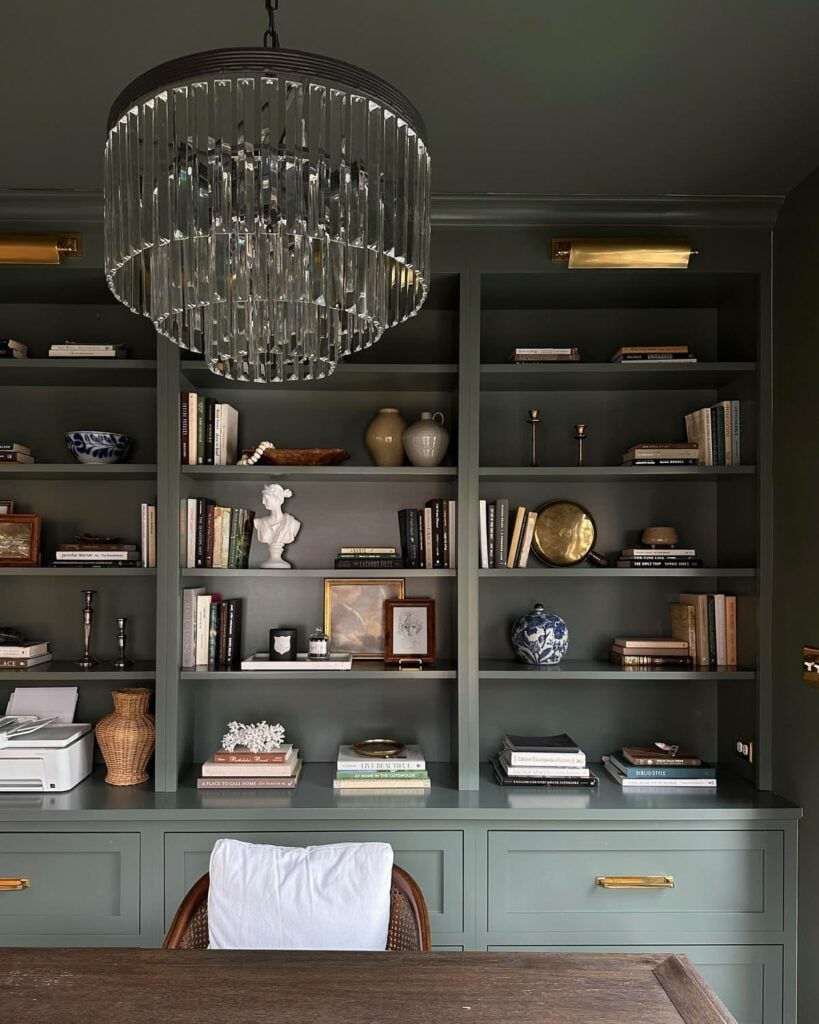
One of my favorite examples is this beautifully color-drenched office by Emily White (@werethewhites), where Rosemary creates a rich, classic backdrop without ever feeling too heavy.
With an LRV of 14, Rosemary sits firmly in the darker range, but thanks to its soft gray undertones, it never feels overwhelming. Instead, there’s something simultaneously soothing and refined about it. As you can see from this gorgeous example, it also plays beautifully with brass and wood accents alike.
Best for: Home offices, libraries, cabinetry, and anyone wanting a rich green that feels classic without overwhelming a space.
4. “Rock Bottom” by Sherwin Williams-
If you’re anything like me and always seem to default to black paint when going dramatic, consider this your invitation to take a little walk on the wild side… (Sorry, Lou Reed…I couldn’t resist.)…
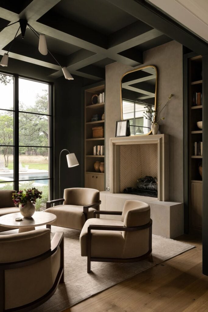
With an LRV of only 7, Sherwin-Williams Rock Bottom is by far the darkest color in this roundup. While it can easily pass for a soft black in lower light, its subtle mossy green undertones give it just enough warmth and dimension to feel a little more organic and a little less expected.
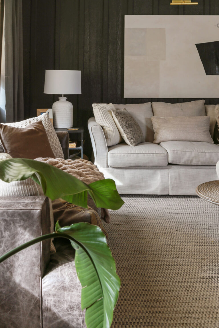
One of my favorite examples is this stunning living space by Studio McGee (who… let’s be honest…could make a cardboard box look sexy). Here, Rock Bottom creates dramatic contrast without overpowering the room- allowing the warm woods, creamy upholstery, and plaster material on the fireplace to soften the space beautifully.
Best for: Anyone who usually defaults to black but wants something with a little more depth, warmth, and personality. I especially love it for libraries, studies, living rooms, and dramatic built-ins.
5. “Pewter Green” by Sherwin Williams-
I could spend the next three paragraphs talking about undertones and LRVs…or I could simply tell you that Sherwin Williams Pewter Green just… f**king… works…
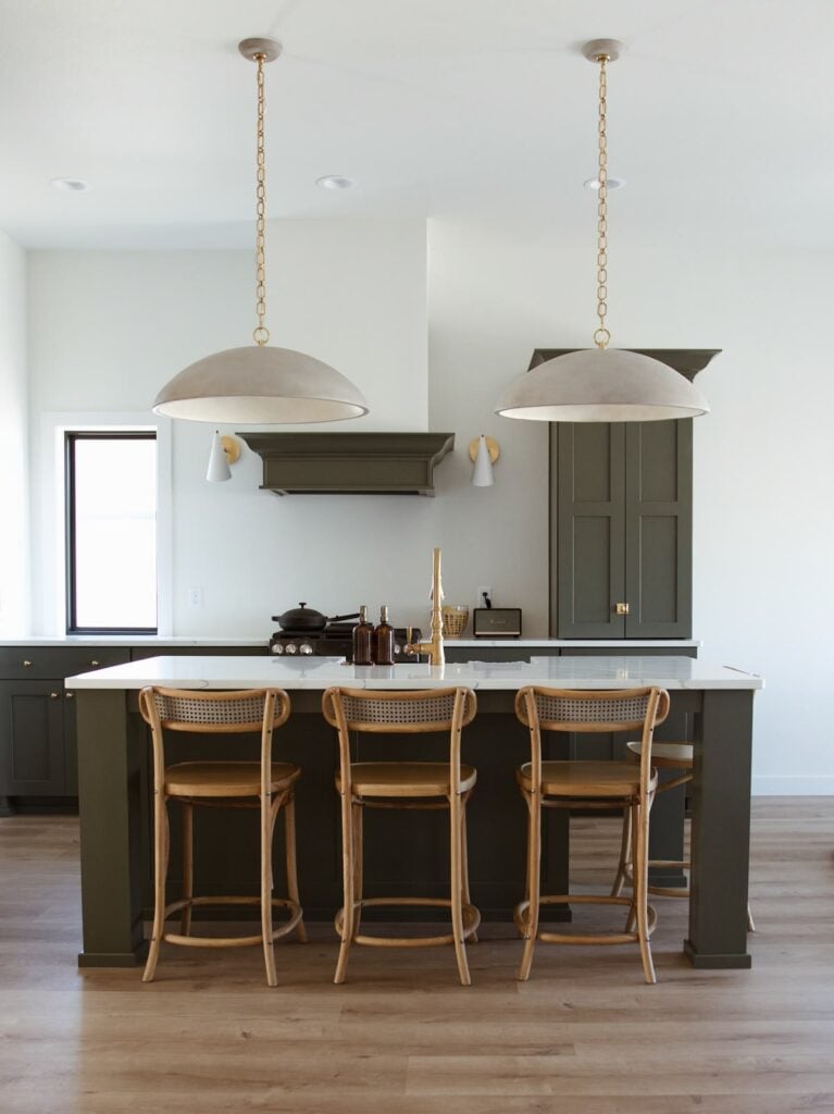
Need proof? Just take one look at this gorgeous kitchen by Chelsey Freng. It’s everything I love about black cabinetry…just a little less intense and a whole lot more calming and approachable (at least for a nature-lover like myself).
With an LRV of 12, Pewter Green is a cool, muted green whose gray undertones keep it from feeling overly vibrant or trendy. Instead, it quietly complements natural wood, stone, brass, and creamy whites, making it incredibly versatile.
Best for: Kitchen cabinetry, mudrooms, pantries, built-ins, and anyone wanting the drama of dark cabinetry with a softer, more organic feel.
Thank you so much for stopping by and spending some time with me this week!
If you happen to identify as a fellow “color shy” decorator, I hope today’s roundup gave you a few green paint colors worth experimenting with. And even if green isn’t your jam, I hope it inspires you to go out and find the color that makes your own highly sensitive nervous system breathe a little easier.
Until next time, keep on designing a life that feels as good as it looks!

Welcome!
My journey in interior design and home improvement began with transforming my first fixer-upper home, all while managing a budget and raising two young boys. My work, a reflection of my passion for creating beautiful, uplifting spaces, has been recognized by top publications like Better Homes and Gardens Magazine, HGTV, and more. I invite you to explore my site and witness the transformation of my home and the vibes we've designed. Read more...




I love a sage green, such an earthy color, and it goes well with browns, gold, clay, beige, and wood tones. It reminds me of nature.
I couldn’t agree more, Laura! Sage greens are beautiful, and there were definitely a few that narrowly missed making this roundup. Sounds like I may need to put together a Part 2! 😊