

My Honest Review of Moth Wing by Sherwin Williams
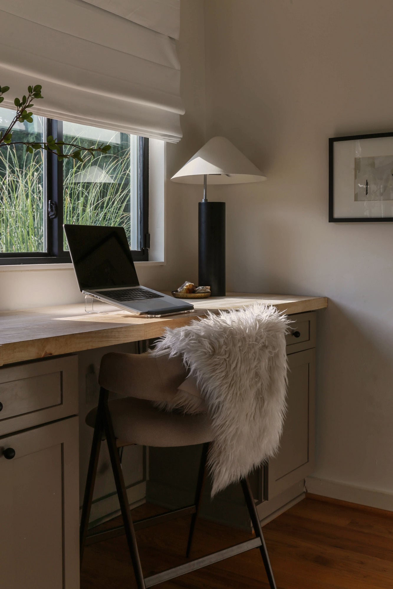
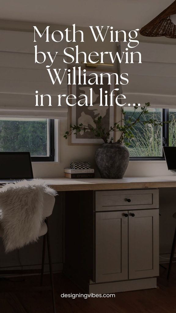
Looking for a warm, earthy neutral with a little depth? Today I’m sharing my experience with Sherwin Williams Moth Wing SW 9174, including its undertones, LRV, coordinating colors, and plenty of real-life photos…
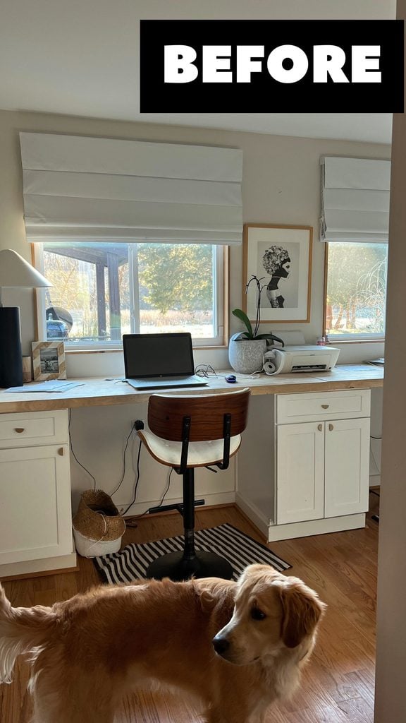
For almost 5 years now, my office has essentially been the place where leftover decor goes to die.
Essentially a glorified hallway that connects our living room to the powder room, I just couldn’t justify allocating my already lean renovation budget to such a small, awkward space (especially with far more important spaces like kitchens and bathrooms still needing updates).
That is…until I color drenched the adjacent powder room and gave the space a budget-friendly makeover. Once everything was complete in that space, it suddenly made my neglected little office stick out like a sore thumb.
Overwhelmed by the thought of painting an entire room, I reasoned with myself that I could simply paint the cabinets (and windows) to give the space a little more depth and personality.
And so began my two-month search for the perfect paint color to cover these basic, builder-grade white cabinets.
Okay, two months may be slightly dramatic, but why was finding the right color so damn difficult?
Well…I had a surprisingly specific wish list…
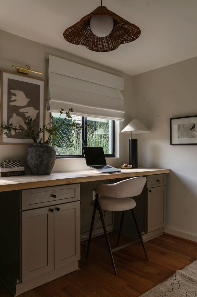
The cabinet color needed to be warm enough to counteract the cooler light in my northeast-facing office, dark enough to provide some real contrast against the existing Shoji White walls, and forgiving enough to play nicely with my dated, overly warm hardwood floors.
All roads led me to Moth Wing by Sherwin Williams..
What color is Sherwin Williams Moth Wing?
Sherwin Williams officially describes Moth Wing SW 9174 as a warm, medium beige with gray undertones and categorizes it as part of its neutral color family.
But if I’m being completely honest… “beige” isn’t necessarily the first word that comes to mind when I look at it in my own home (remember this room is NE facing).
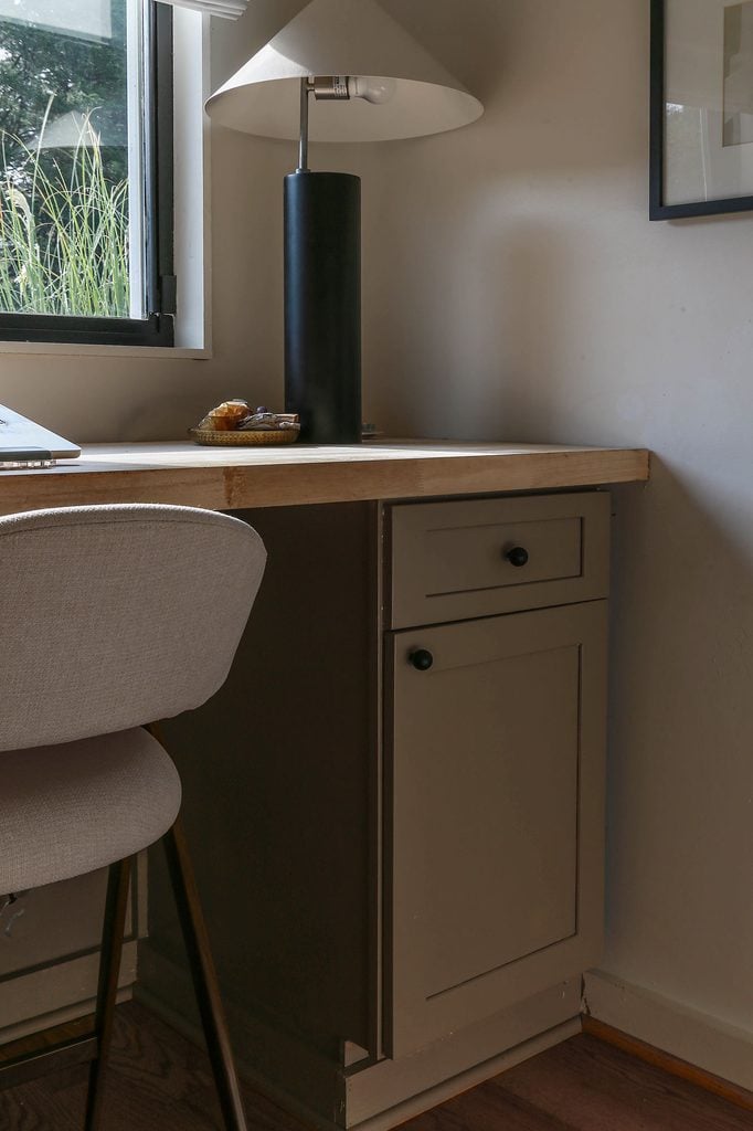
To my eye, Moth Wing is more of a muddy, earthy taupe that dances somewhere between khaki, greige, and mushroom depending on the time of day. It’s warm and grounded without veering too brown thanks to its grey undertones.
And perhaps most importantly (especially for those of us still recovering from the cool-gray-everything era of the 2010s), it doesn’t read like a traditional gray.
What is the LRV of Sherwin Williams Moth Wing SW 9174?
With a Light Reflectance Value (LRV) of 29 (with 0 being black and 100 being white-white), Moth Wing falls comfortably into the medium-dark range. In other words, it has enough depth to make a statement and provide some serious contrast, but it isn’t so dark that it completely swallows a space.
And for my office, that depth was incredibly important.
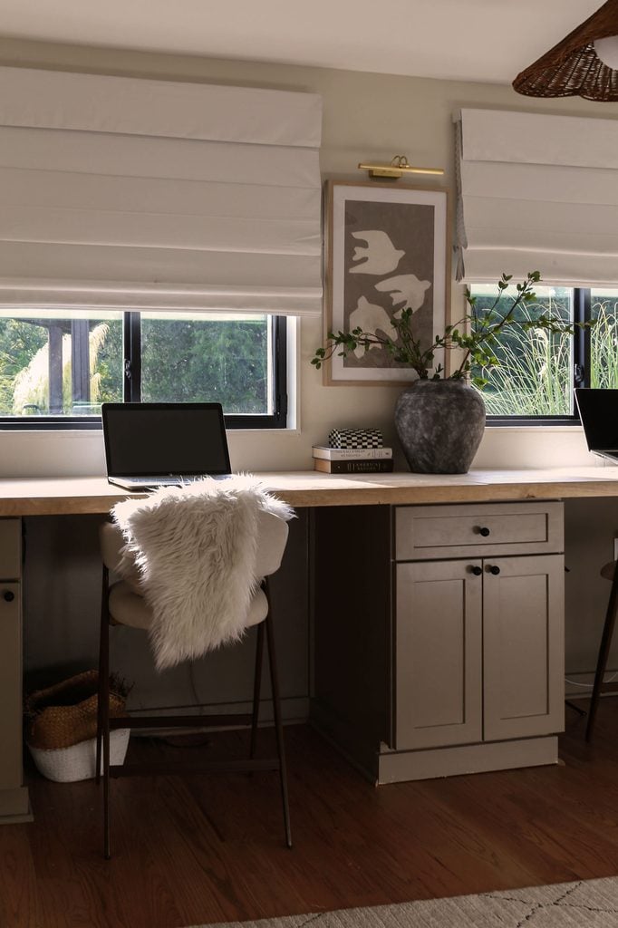
With my Shoji White walls LRV at 74, I needed a cabinet color dark enough to actually ground the room and create noticeable contrast. At the same time, because this is a relatively small, northeast-facing space, I wasn’t necessarily looking to go super dark either.
For me, Moth Wing landed right in that sweet spot.
What are the undertones in Sherwin Williams Moth Wing?
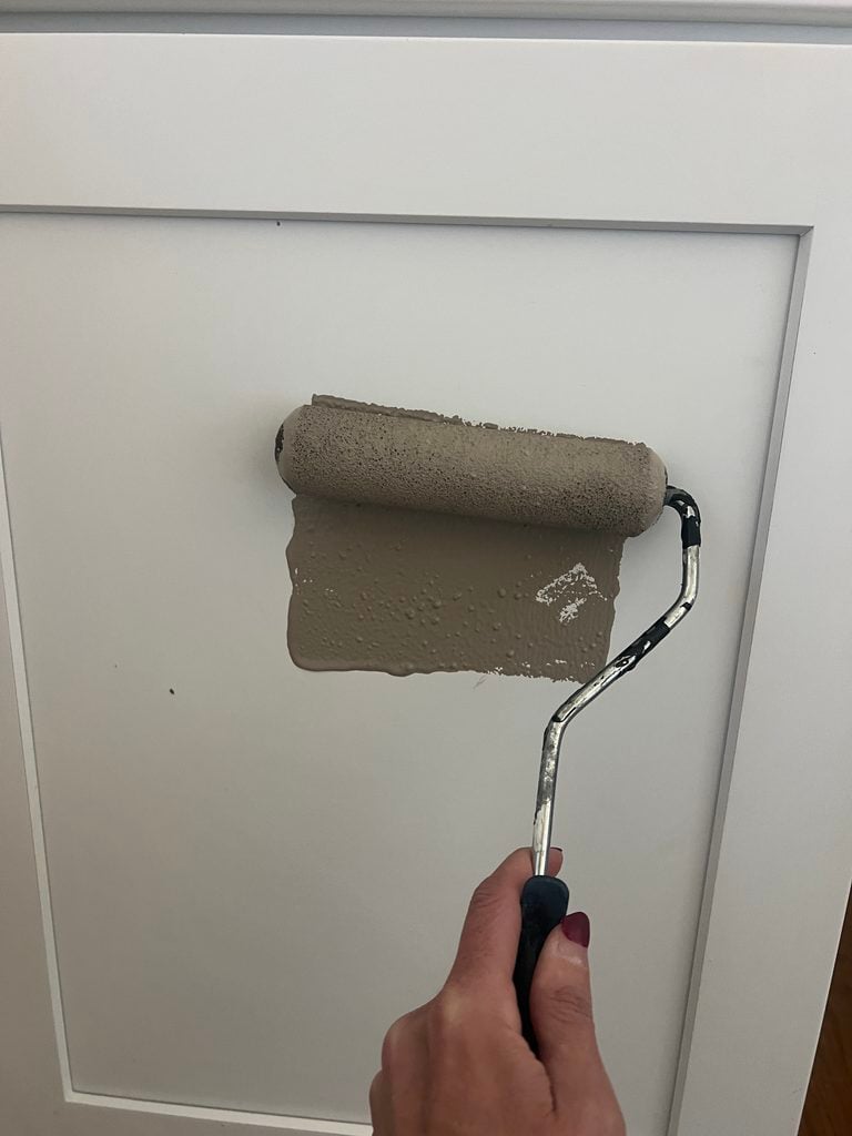
Sherwin Williams Moth Wing has gray undertones layered into a warm beige base. However, depending on the lighting, those gray undertones can cause the color to shift considerably- sometimes reading more taupe, mushroom, khaki, or even greige.
In my northeast-facing office, Moth Wing tends to shift somewhere between khaki, taupe, mushroom, and greige depending on the time of day.
When the room is receiving warmer natural light, I notice more of its earthy khaki-brown side. In cooler light, however, those gray undertones become much more apparent, and there are absolutely times when I would describe Moth Wing as a deeper, warm greige.
Interestingly, the dining room that originally inspired me to use Moth Wing looks much closer to Sherwin Williams’ official description. In this gorgeous space by Katy Stillwell, the color reads as a warm beige with subtle gray undertones…
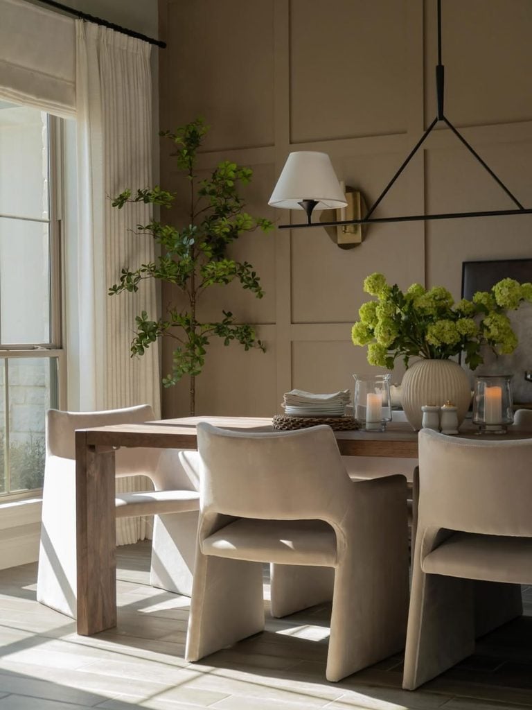
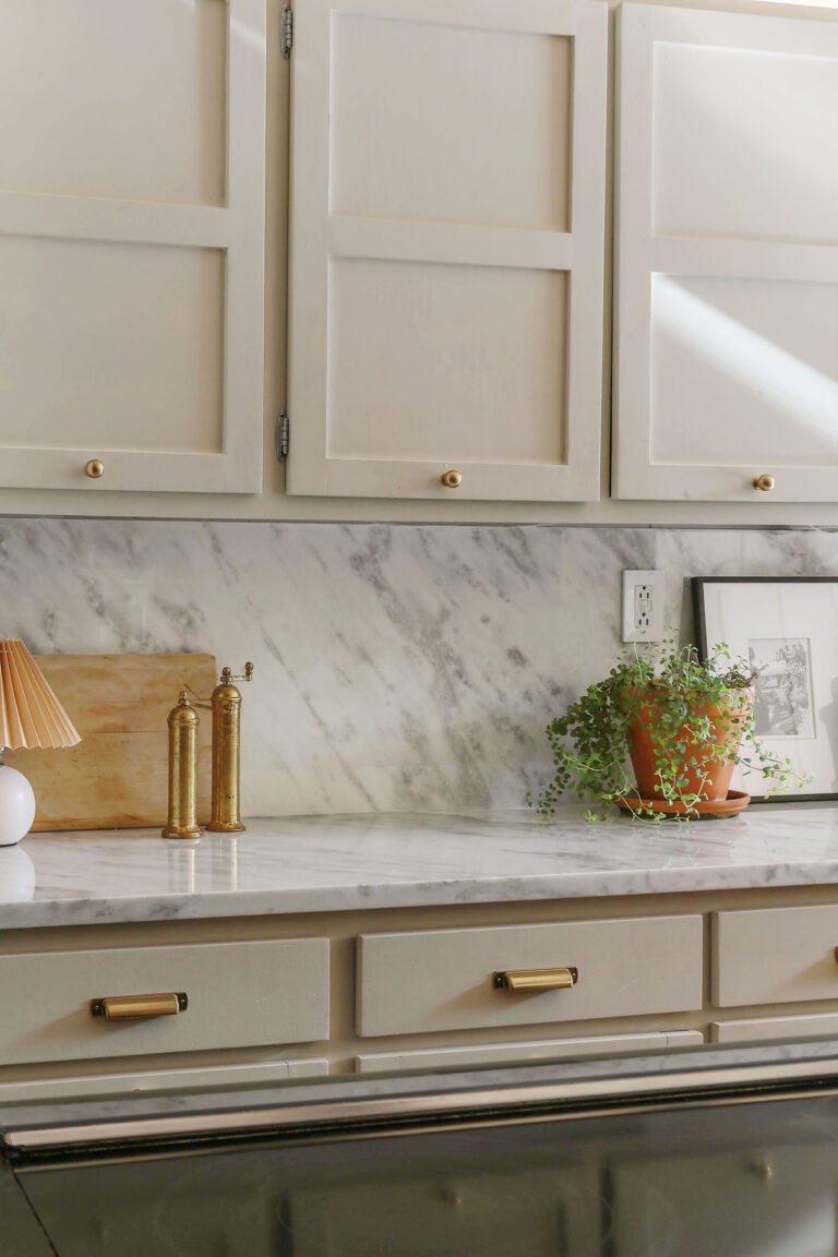
Compare that to Moth Wing on the cabinets in my northeast-facing office, and you can see just how much lighting and exposure can influence this color. In my space, the beige is less apparent and Moth Wing reads a little cooler and more mushroom (or warm greige) than true beige.
What colors go with Sherwin Williams Moth Wing?
Because Moth Wing sits somewhere between a warm beige and greige, I’ve found it surprisingly easy to pair with other earthy neutrals.
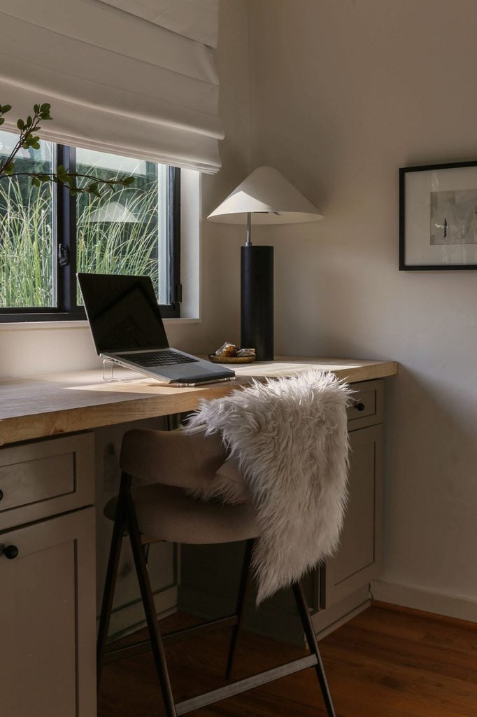
In my own office, I paired Moth Wing cabinetry with Sherwin Williams Shoji White walls, and I couldn’t be happier with the combination. Shoji White is light enough to provide noticeable contrast against Moth Wing’s LRV of 29, but its warmth keeps the two colors from feeling disconnected.
I also love Moth Wing alongside black accents, warm wood tones, creamy whites, brass, and earthy greens. In fact, I think the black window trim and hardware are especially important in this room (it gives all of those softer, muddy neutrals a little definition).
And perhaps most impressively, Moth Wing manages to coexist peacefully with my very warm, very much not-of-my-choosing hardwood floors. The gray in Moth Wing keeps the overall palette from becoming too warm, while its beige/brown base prevents it from fighting against the orange tones in the wood.
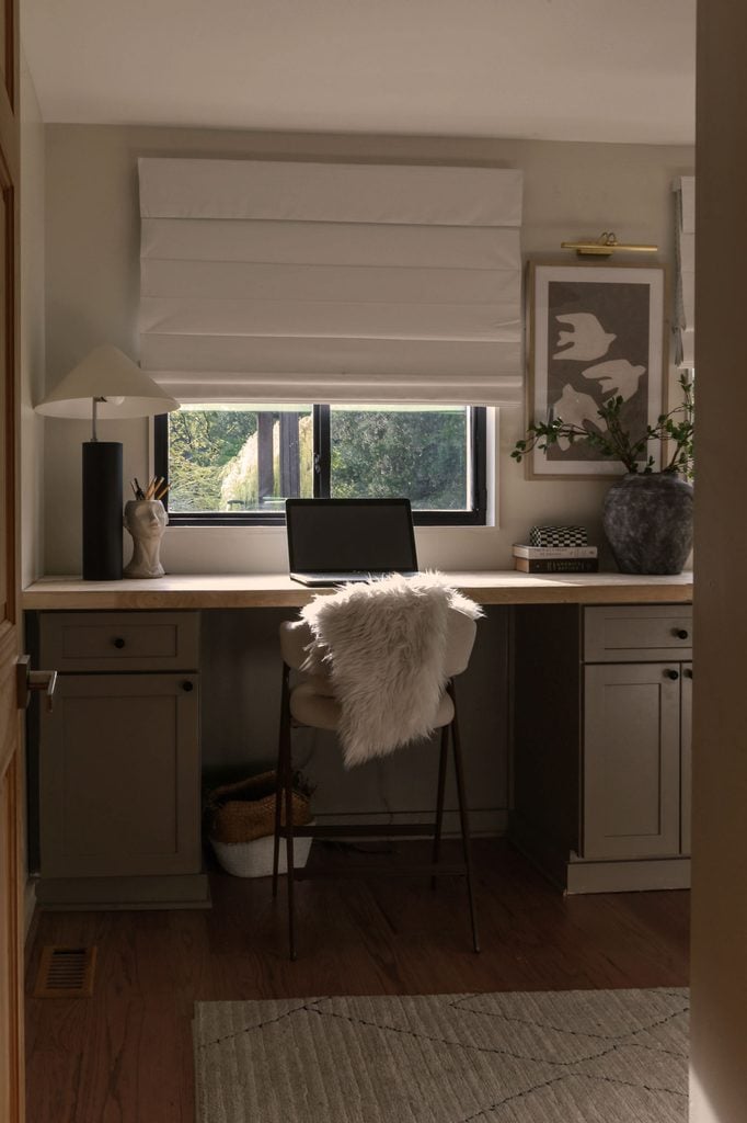
After spending waaay too much freakin’ time agonizing over these cabinets, I can confidently say Moth Wing was worth the hunt.
If the usual greige suspects like Accessible Beige or Agreeable Gray are reading too gray, too light, or just a little flat in your space, this warmer, moodier neutral may be worth a sample. As for my office, it’s still very much a work in progress (I’m currently scheming some sort of wall treatment), but for now, I’m just happy these builder-grade white cabinets finally have some personality.
Thanks so much for stopping by and spending some time with me this week! It would mean the world to this little blog of mine if you could “pin” this post on Pinterest or share with a friend…
Until next time, keep on designing a life that feels as good as it looks!


Welcome!
My journey in interior design and home improvement began with transforming my first fixer-upper home, all while managing a budget and raising two young boys. My work, a reflection of my passion for creating beautiful, uplifting spaces, has been recognized by top publications like Better Homes and Gardens Magazine, HGTV, and more. I invite you to explore my site and witness the transformation of my home and the vibes we've designed. Read more...




Such a delicious colour! Undertones are gorgeous. I experienced the huge effect of sun exposure in a bad way. Painted my new house walls the same colour as my old house because I had loved the colour and found it so warm and inviting. Different exposure and it was Terrible (capital T terrible) and then had to live with it for many years until we found the time to repaint the entire house. I was very careful choosing the white that I changed it to and I got it perfect the second time. You are so talented.
Oh Meredith, I feel this in my soul! 😂 It’s crazy how you can KNOW you love a paint color and then put that exact same color in a different house and suddenly wonder what on earth happened. Lighting really is everything and paint is such a freakin’ beast to master. Thank you so much for your incredibly kind words, and for sharing your experience. xoxo
Looks beautiful Erica!! Love the color and the room. Very sophisticated and cozy.
Thank you so much, Lilly! 🤍 Sophisticated and cozy is exactly what I was hoping for in this little space, so that means a lot to me. I’m so glad you love how it turned out! 😊
I really like the color you chose and I think your office is perfect!
Aww thank you, Donna! 🤍 I’m really happy with how this little room came together too. I hope you have had a wonderful summer! 😊
Did you use a specific TYPE of paint to cover your cabinets? Emerald Urethane Trim Enamel, perhaps? I always worry about the prospect of sticking.
Yes, Stella! I used Sherwin-Williams Emerald Urethane Trim Enamel…it’s actually my go-to paint for cabinets. Mine did stick in a few spots, but that was entirely my own doing. 😂 I got impatient and closed some of the drawers before the paint had fully dried. When I unstuck them, I ended up with a little damage that I kept meaning to touch up…and somehow never got my act together to do it haha. So definitely give everything plenty of time to dry before closing the doors and drawers. Whoops! lol
Love the color and it definitely elevated the space. Any links for the window shades? Thanks!
Thank you so much, Nadine! I’m so glad you like it! 🤍 The shades were actually from Home Depot, but unfortunately I haven’t been able to track down my receipt or the exact product to give you a direct link. I can tell you they were very budget-friendly though! I’m sorry I can’t be more specific, but hopefully that helps point you in the right direction. 😊
Wow that looks gorgeous on the wall.