
My Honest Review of Coastal Plain by Sherwin Williams
Looking for a pop of color that is both soothing and earthy? Today I am sharing my honest, real-life experience and review of the neutral green color Coastal Plain (SW 6192) by Sherwin Williams along with why I ultimately decided to paint over it…
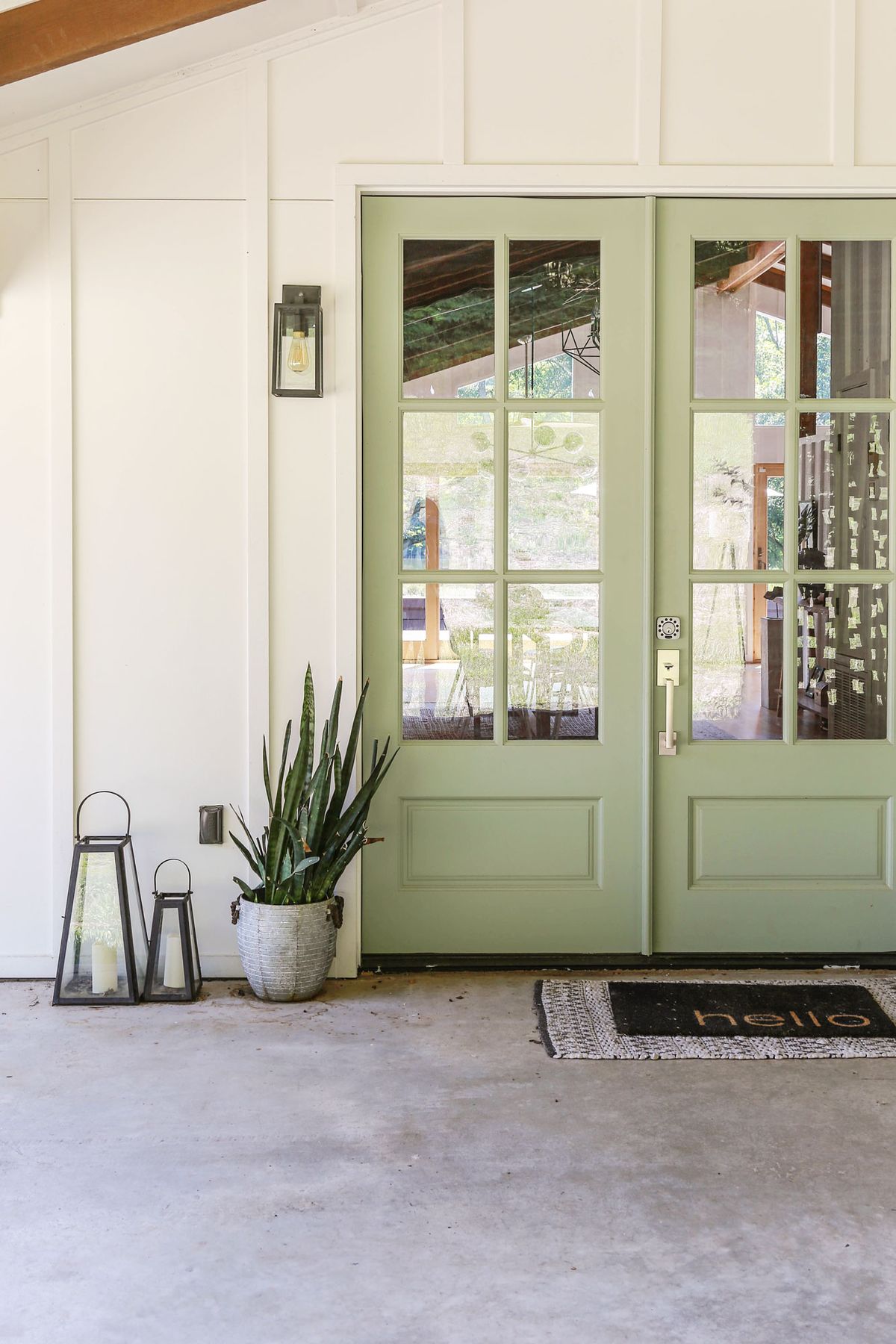
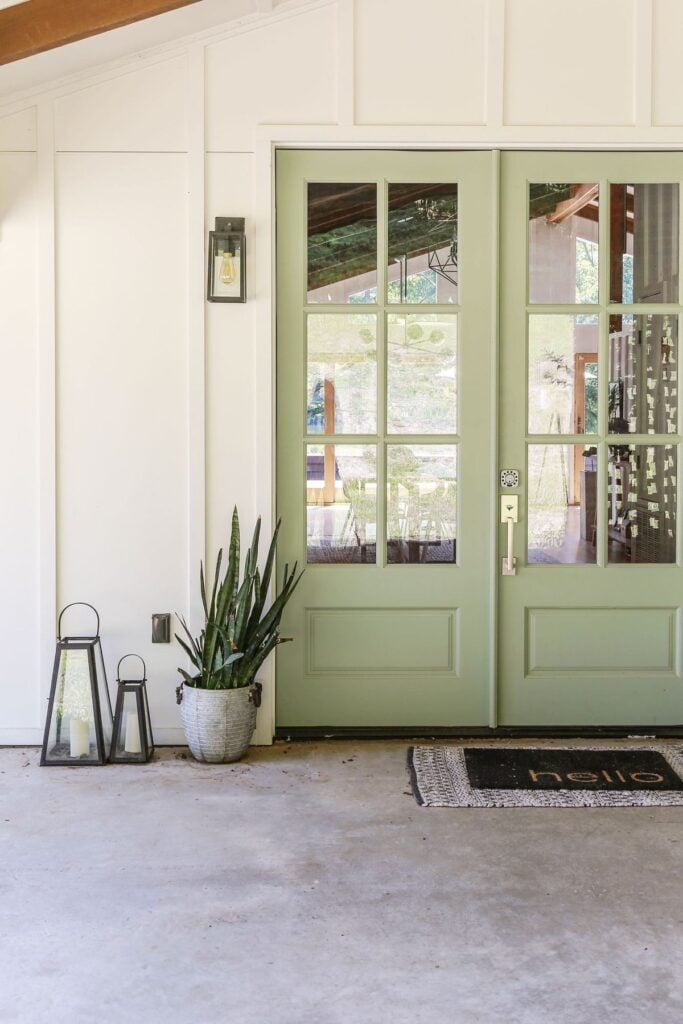
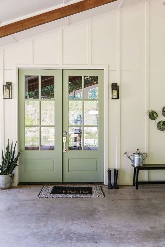
Hands down, one of the most asked questions I get on Pinterest (going on three whole years now) is about the green paint color on my front doors. Realizing I have never even done a dedicated post about the paint color (which is Sherwin Williams’ Coastal Plain) I thought today would be the perfect time to address the subject matter as I have somewhat reached a lull in DIY projects here at the lake cottage recently.

In all honesty, I can’t necessarily even say for sure why I avoided this much-requested paint review for as long as I have. It may have to do with the fact that it kind of feels odd to write about a paint color I ultimately decided to change (or the fact that I am not even the one who can take credit for choosing the color as this is how my lake cottage came the day we moved in).
But given the popularity of my door color (or what once was my door color) has only gained more traction, today I am going to finally give the people what they freakin’ want. So… let’s get into all the juicy deets on this neutral, coastal-inspired paint color.
What is the LRV of Coastal Plain?
On the LRV (Light Reflectance Value) spectrum with zero being the lowest value (like a true black) and 100 being the highest (like a pure white), Sherwin Williams’ Coastal Plain is a 37. This means that , while it does have a generally airy, cheerful vibe, it actually absorbs more light than it reflects. This lower LRV is what gives the green color a soft, muted quality.
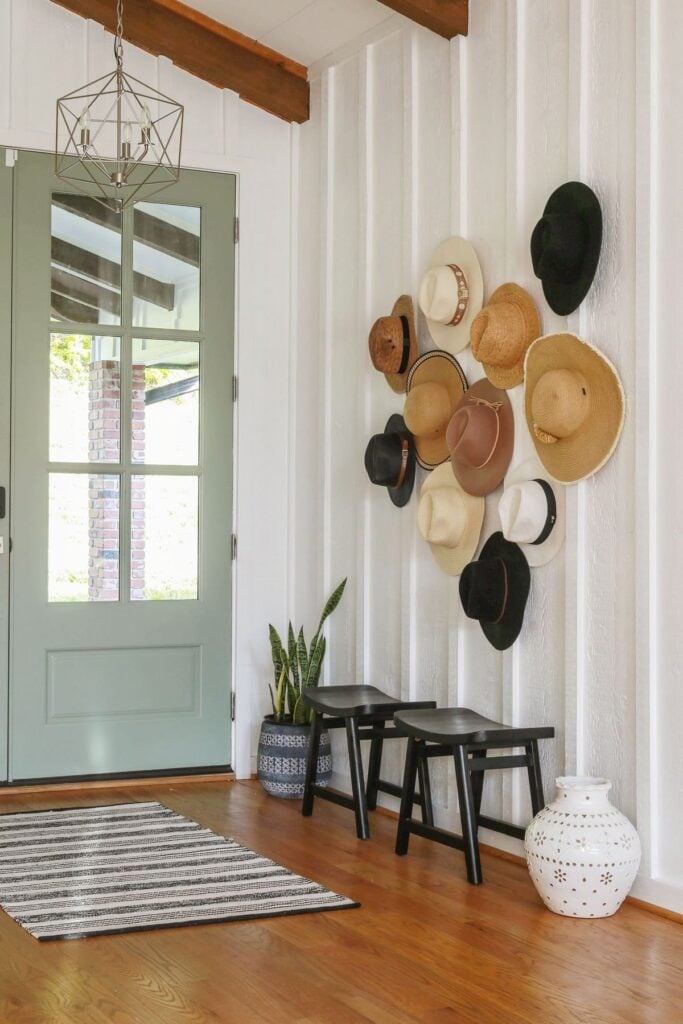
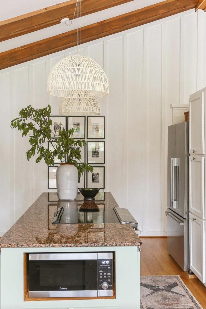
Given Coastal Plain was painted on my front door and on my kitchen cabinets (both places that received a lot of natural light), the color read fresh and cheerful. But keep in mind, since it falls in the medium-to-low range of light reflectance, it can lean moodier and a bit grayer in rooms that don’t get much light.
What are the undertones in Coastal Plain?
While SW Coastal Plain is categorized among the green color family on Sherwin William’s website, this color definitely has blue undertones which become more apparent depending on lighting conditions.
So this is what leads me to the big, juicy question you probably want to ask me….Why did I decide to paint over Coastal Plain?
Well…while I did think the the muted green color looked beautiful in the warm, balanced light that my front doors received, my east-facing kitchen was a different story….
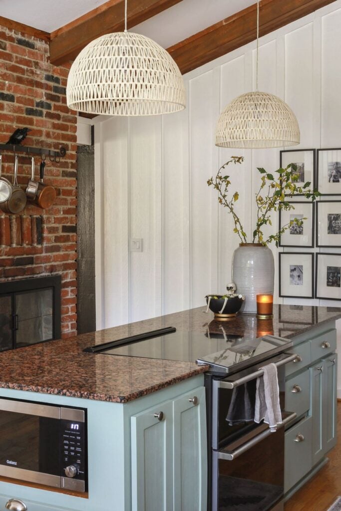
While Coastal Plain looked beautiful in the warmth of the morning light, my east-facing kitchen had other plans. See how baby blue the color looks on my island cabinets (pictured above)?
That’s the cooler natural light pulling out all the blue and gray undertones in Coastal Plain. And honestly, as my style started leaning moodier (I mean… I painted the adjoining living room black for crying out loud), Coastal Plain just wasn’t vibing with the direction the rest of the house was headed. And so…I only lived with the color for about 7 months before I painted over it.
What Colors Go Well with Coastal Plain?
While I have only personally used this color on my front door (both interior and exterior) and on my kitchen cabinets, the walls of my home are painted in Sherwin Williams Shoji White and I believe the warm, off-white color worked beautifully with Coastal Plain. I also think that this muted green (sometimes blue) works beautifully with wood tones.
So in short, this fresh, coastal color works well with creamy whites and warm wood. Sherwin Williams actually claims the color works well with other blue-green neutrals as well, but I couldn’t say for sure.
My Final Thoughts on Coastal Plain:
In the seven months I lived with Coastal Plain, I truly did learn to appreciate the color (at least on my front doors). But…I also realized what a freakin’ shapeshifter it could be (hello baby blue cabinets in an east-facing room). So…before committing to this color yourself, I highly suggest testing out samples in your own unique lighting conditions as the color can read both cool and warm just depending on where you place it.
Thank you so much for stopping by and spending some time with me! I hope this paint review gave you some clarity on whether to consider Coastal Plain for your own home.
If you found this post helpful, it would mean the world to me if you could share it with a friend or “pin it” on Pinterest. Thank you so much for your support!

Until next time, keep on designing a life that feels as good as it looks!


Welcome!
My journey in interior design and home improvement began with transforming my first fixer-upper home, all while managing a budget and raising two young boys. My work, a reflection of my passion for creating beautiful, uplifting spaces, has been recognized by top publications like Better Homes and Gardens Magazine, HGTV, and more. I invite you to explore my site and witness the transformation of my home and the vibes we've designed. Read more...


Erica-
You’re correct about sampling paint before committing. I painted my husband’s bathroom an “alleged” blue and it looked great. The next morning he invited me in to look at his green bathroom walls. I made a trip to SW later that morning. If only I’d sampled.
Have a great rest of the week-
Donna
Oh no, Donna! Paint can be so stinkin’ tricky can’t it? It is truly crazy just how much light can affect the way it reads. Sending you virtual hugs and wishing you a wonderful rest of your week as well. 🙂